Back in spring I was invited to participate in an amazing project.
The task was to create 4 Key Illustrations and a brand mascot/character design as part of the identity of a fresh educational platform helping JC students master critical thinking, persuasive writing, and global awareness through mentorship.
This was one of those rare gems of projects where the inspiring
and collaborative environment made the whole creative process a real treat.
The detailed and thoughtful brief, the respect, the transparency of the communication,
the reliability of the finances: a collection of green flags all around.
The values of the project were in complete alignment
with the actions and presence of the client:
Shoutout to Mrs Chew Tze Lin, founder and principal of The Net.
Thank you for your warm welcome, the trust and the support.
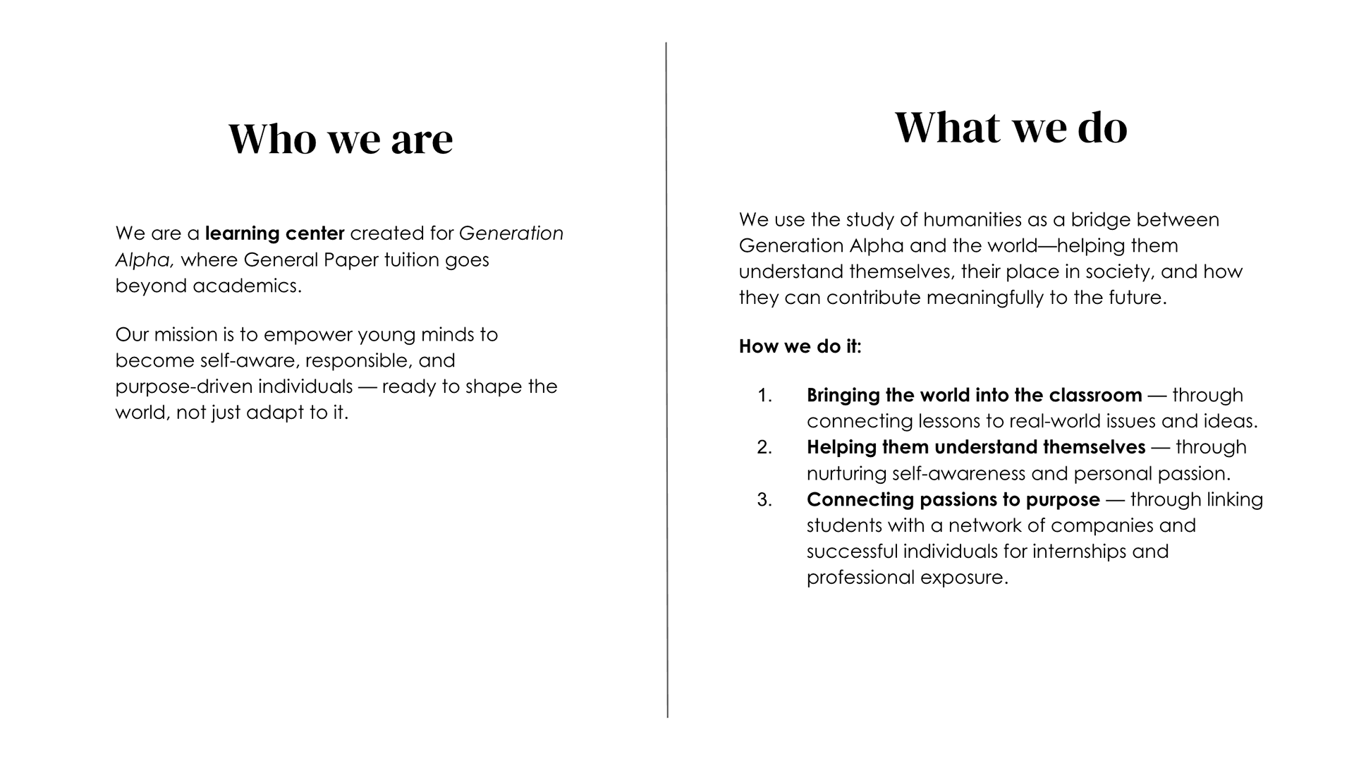

Some of the references from my earlier work as part of the art direction
for the general mood and style of the mascot and the illustrations.
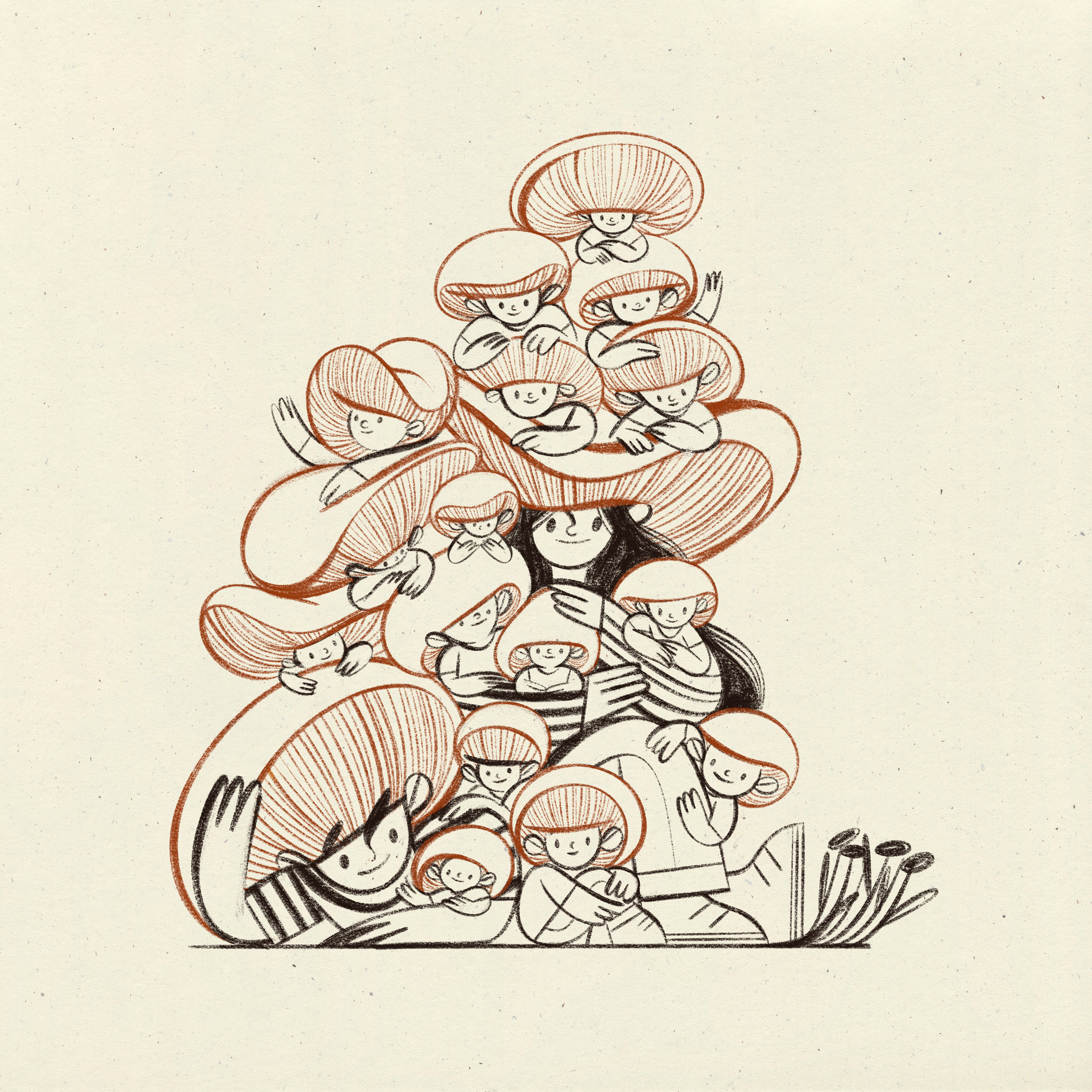
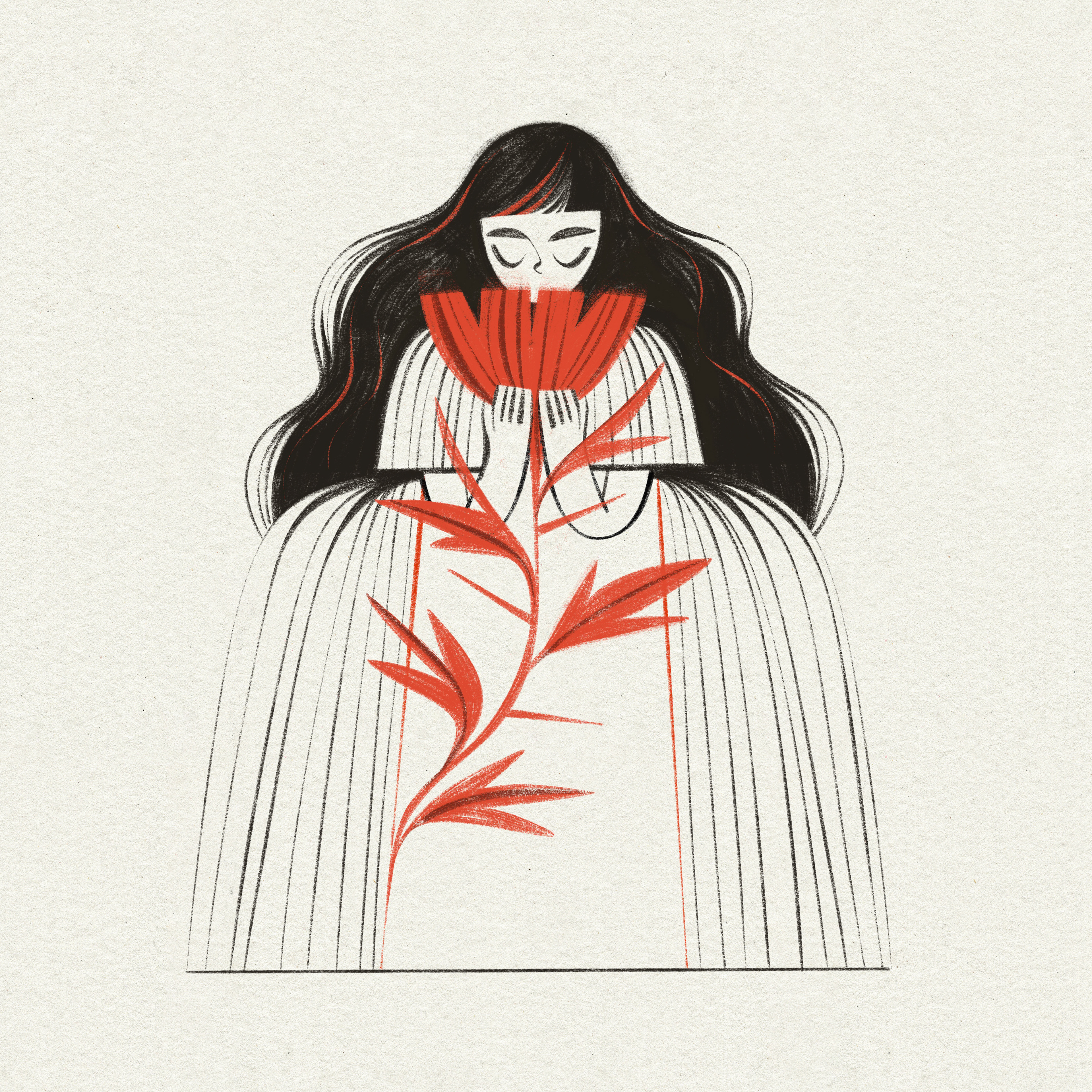
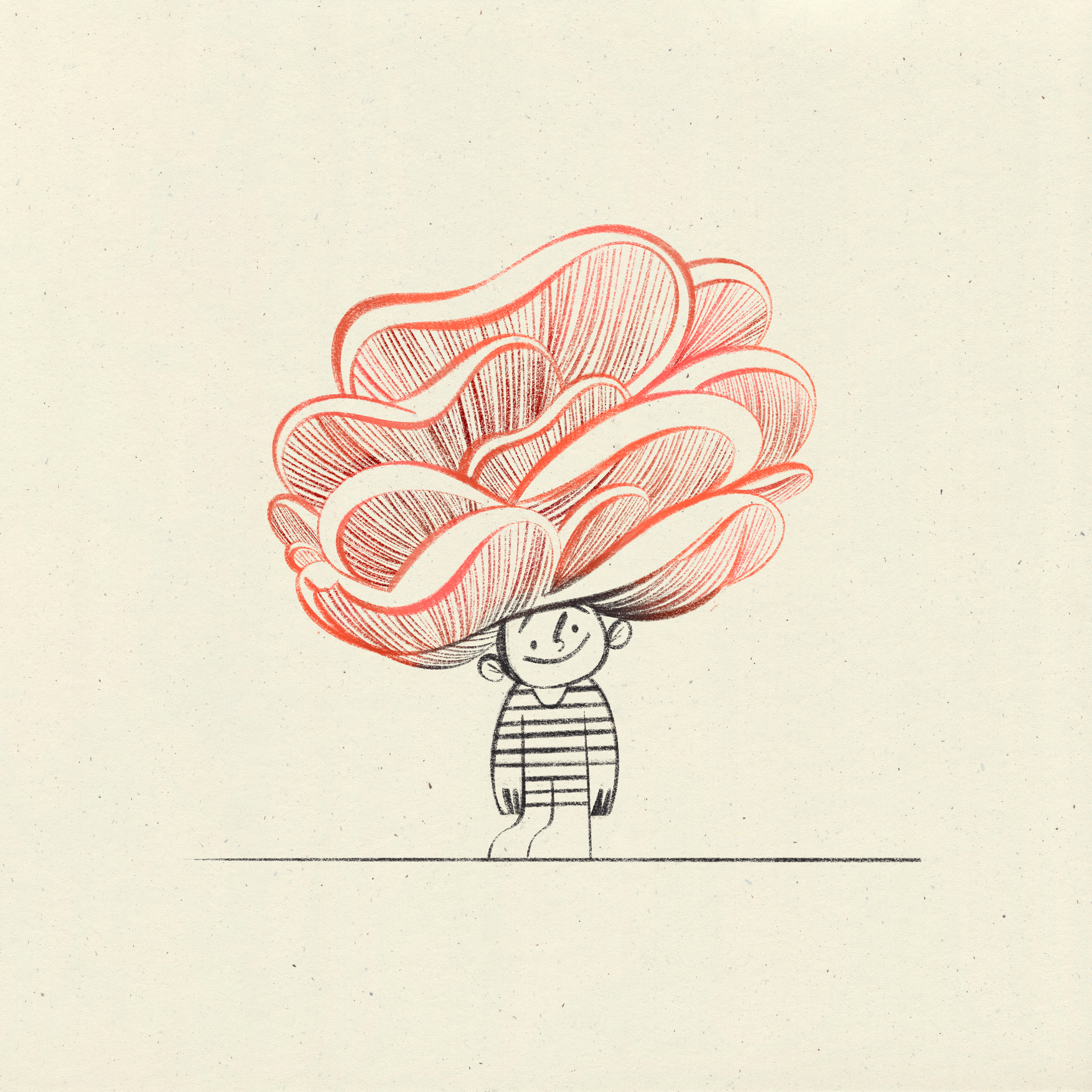
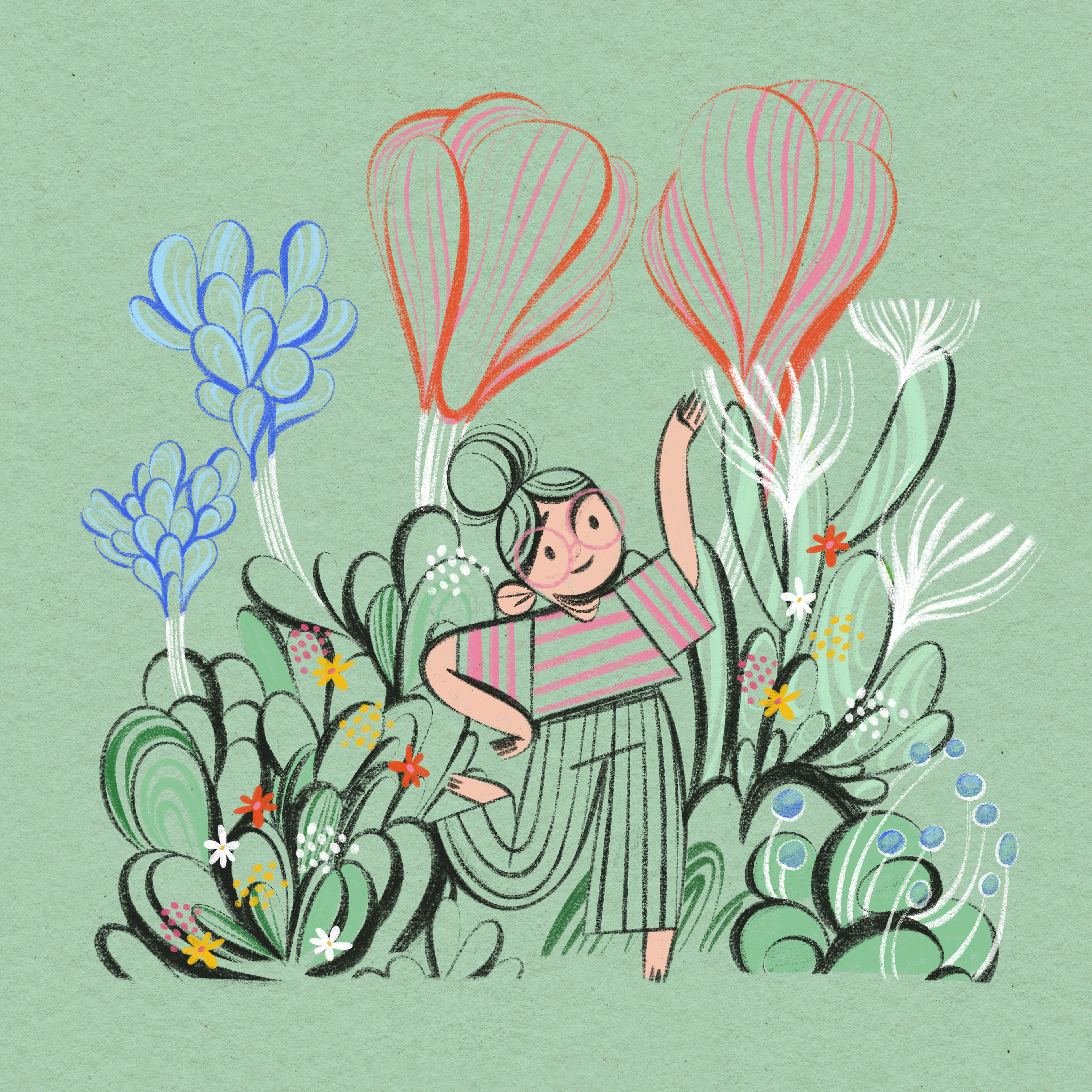
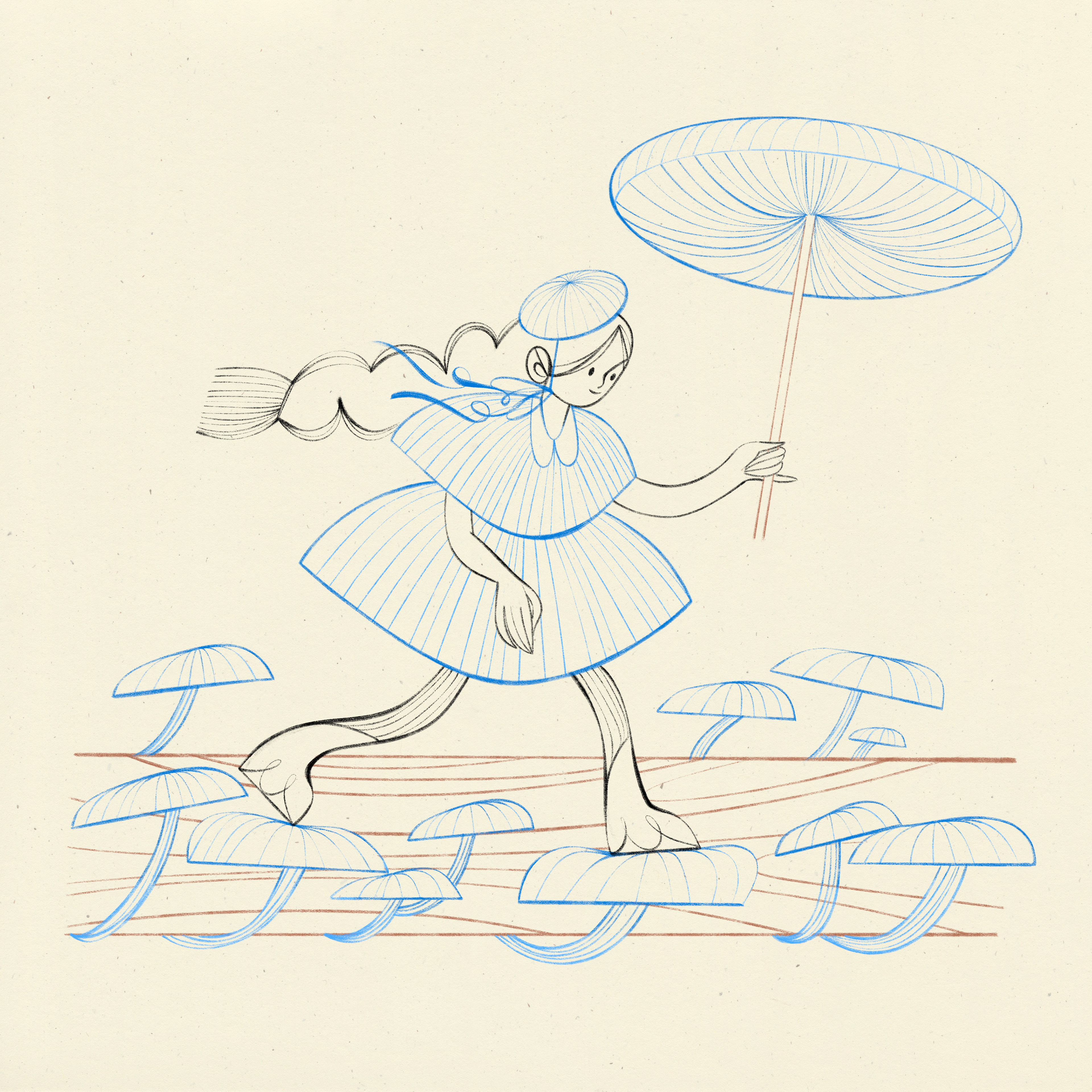
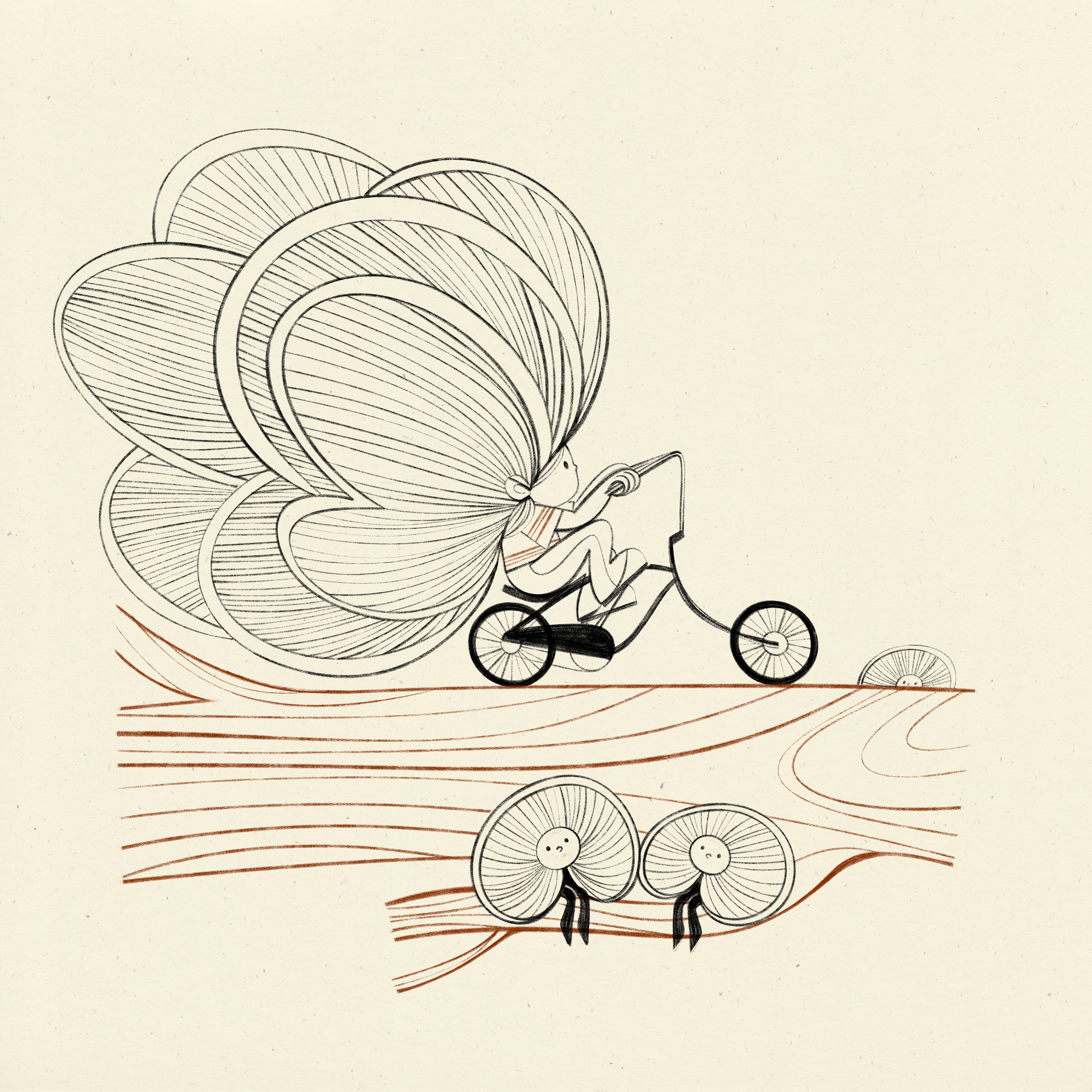
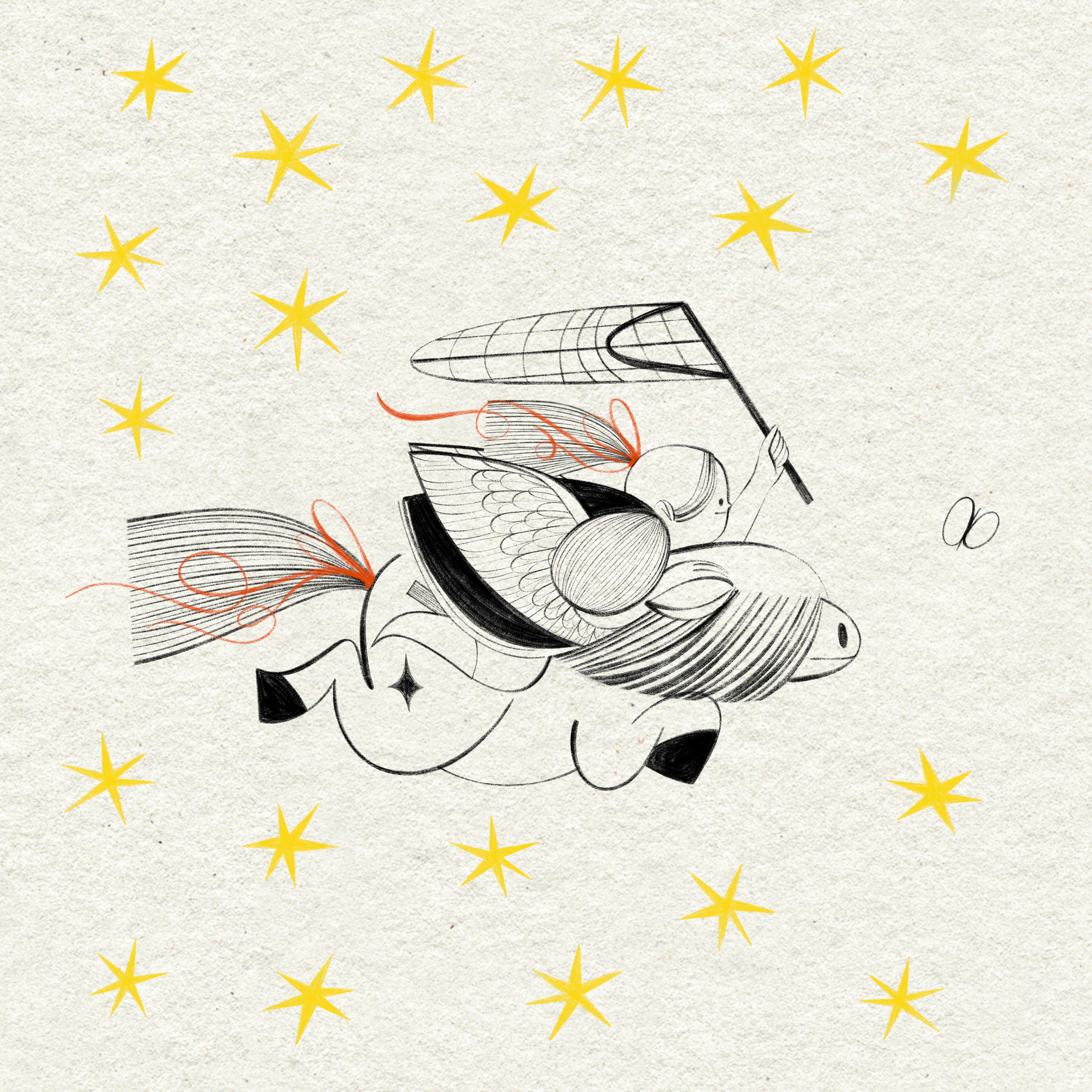
The first round was all about the character design for the mascot.
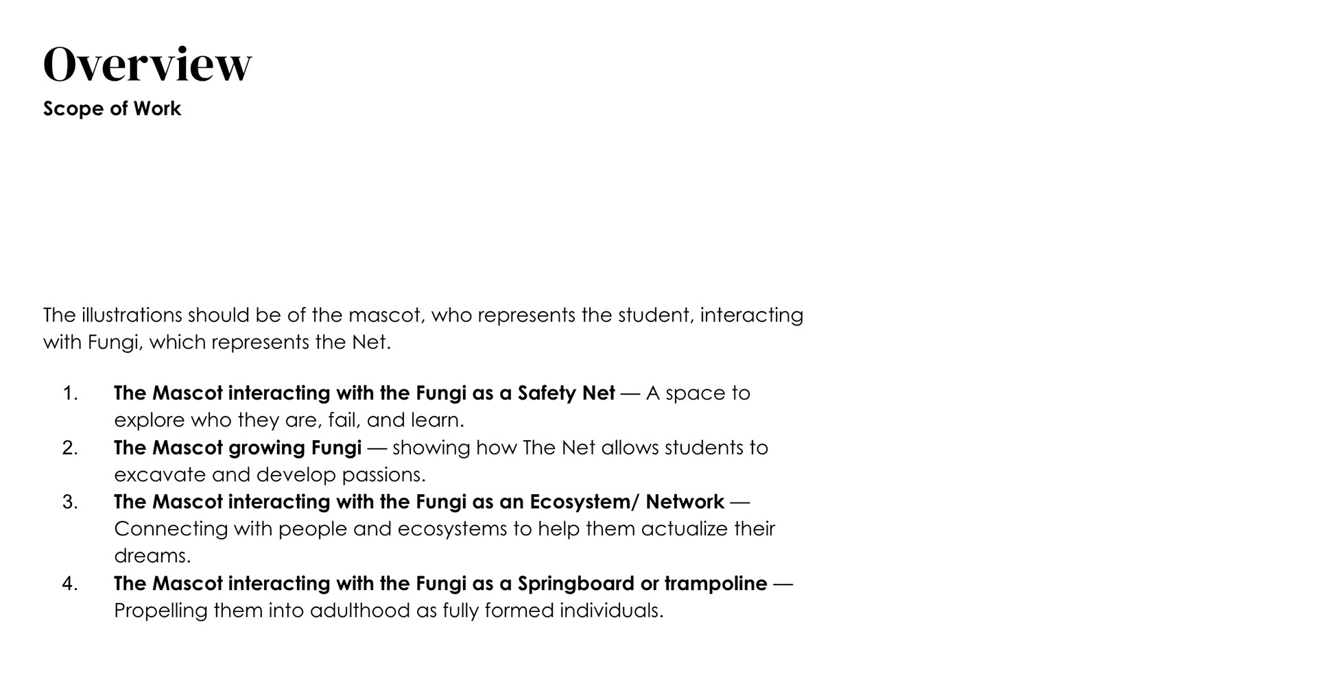
Here is a little snippet from the client brief, that gives you the idea. ( Wish I could share all the wonderful dialogues both in email and via Zoom, but this is Behance and not Substack, so I keep it short with the words.)

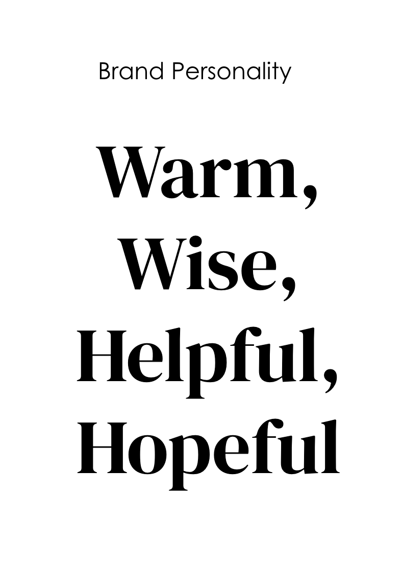
After some initial sketch exploration on possible directions...
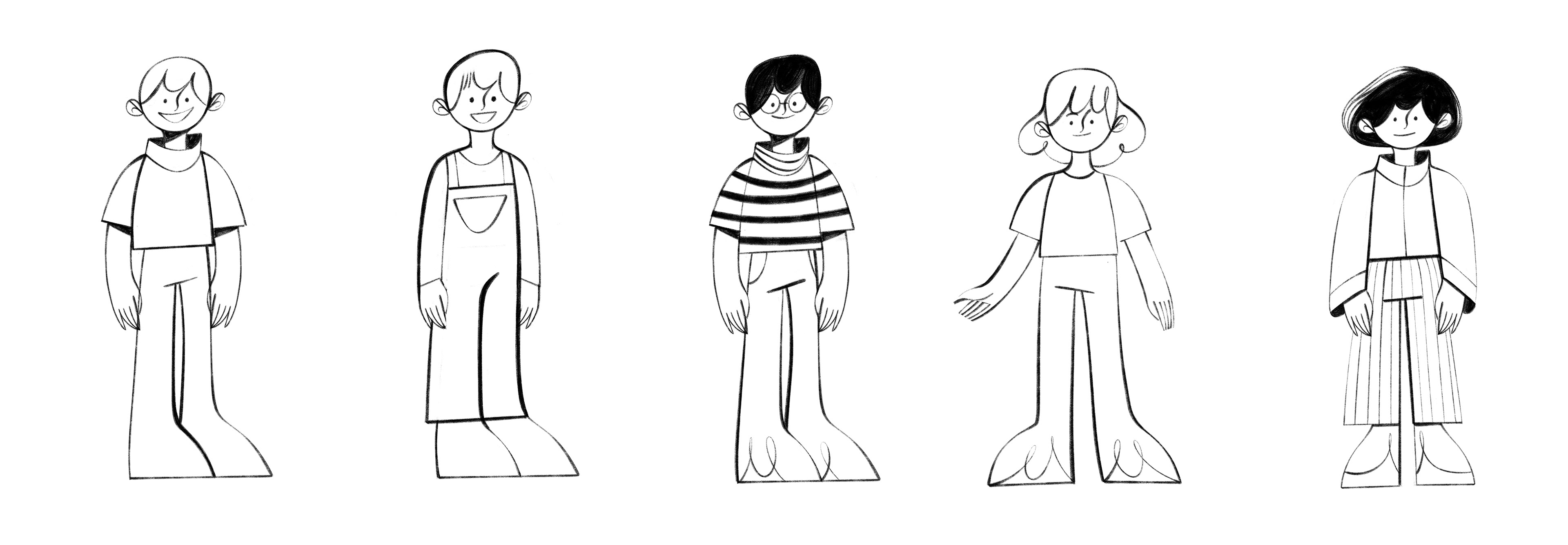
...of hairstyles, expressions, patterns, shapes....
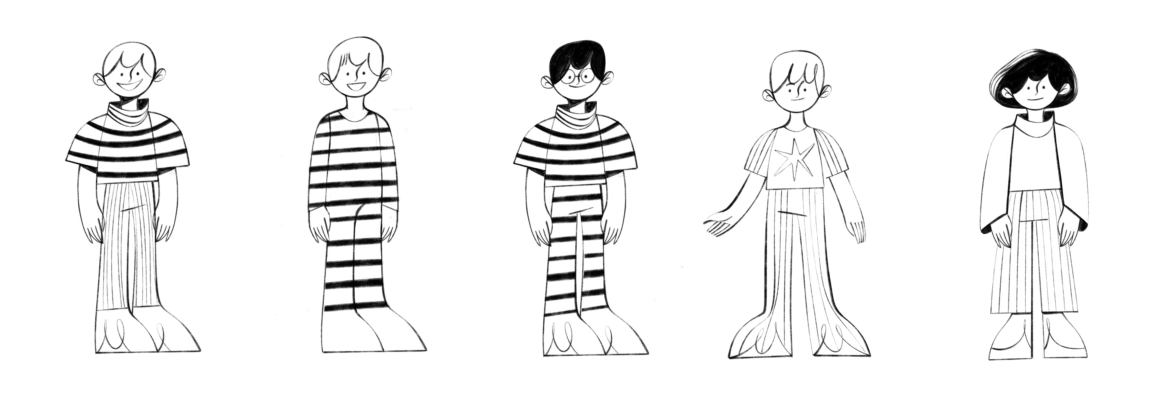
...and some fancy funghi hats...
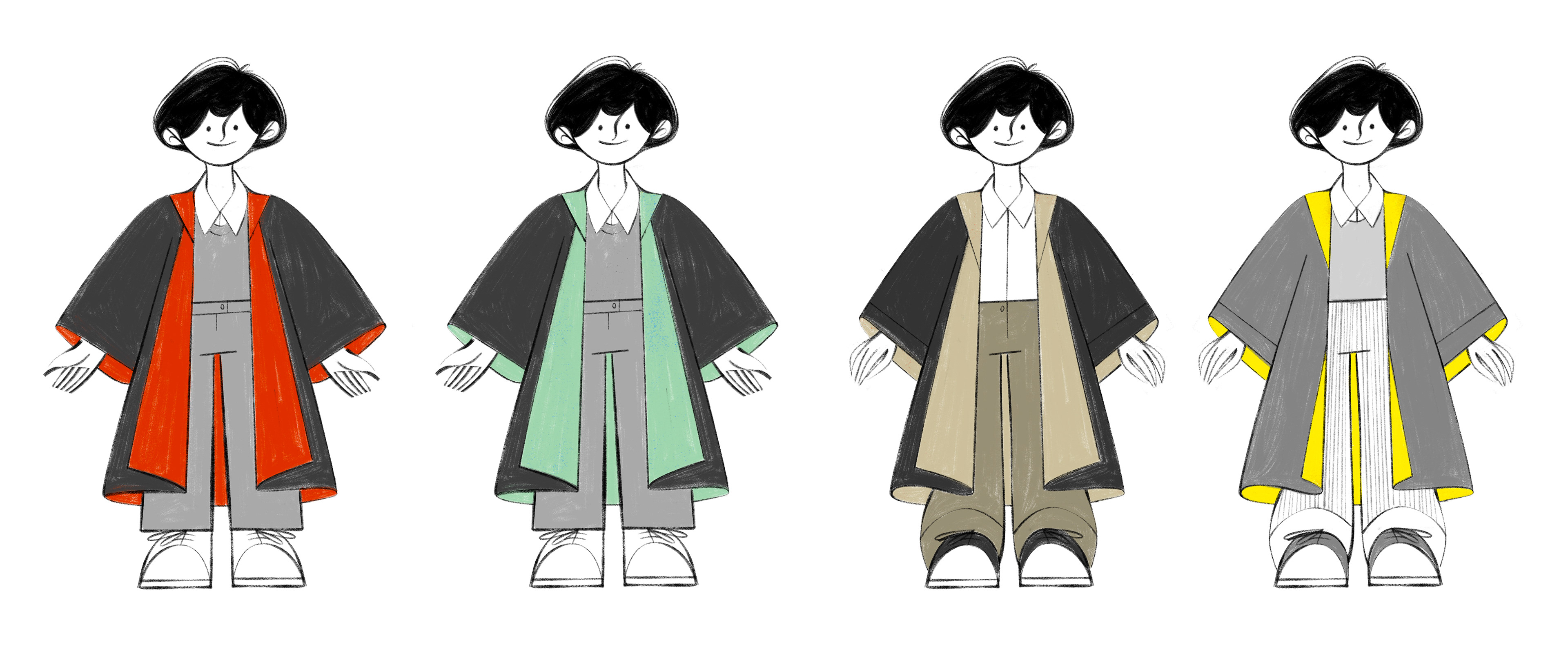
...we narrowed the concept for the facial features, tried on some colors and cloaks
and accessories and some magic...
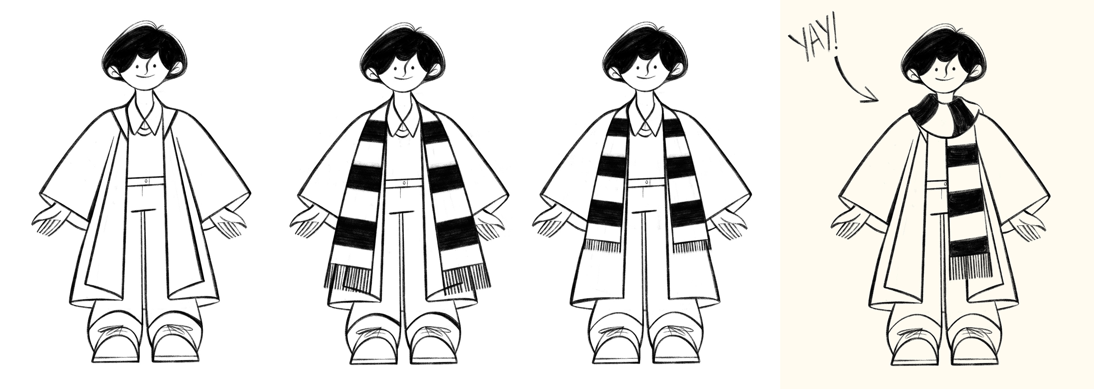
...and finally we found the ONE!
And here we are, step 2: the key illustrations!
First round of sketches, with 3 concepts for each key illustration based on
the brief and our conversations via Zoom.
At this point we were not sure about the scarf yet, and wanted to see how it worked in action, so all concepts had a with and a without scarf version.
This is a shorter selection, so you see the three initial concepts, but they are mostly the scarf versions, since those were the ones we continued working with later on.
1st key illustration - Fungi as safety net
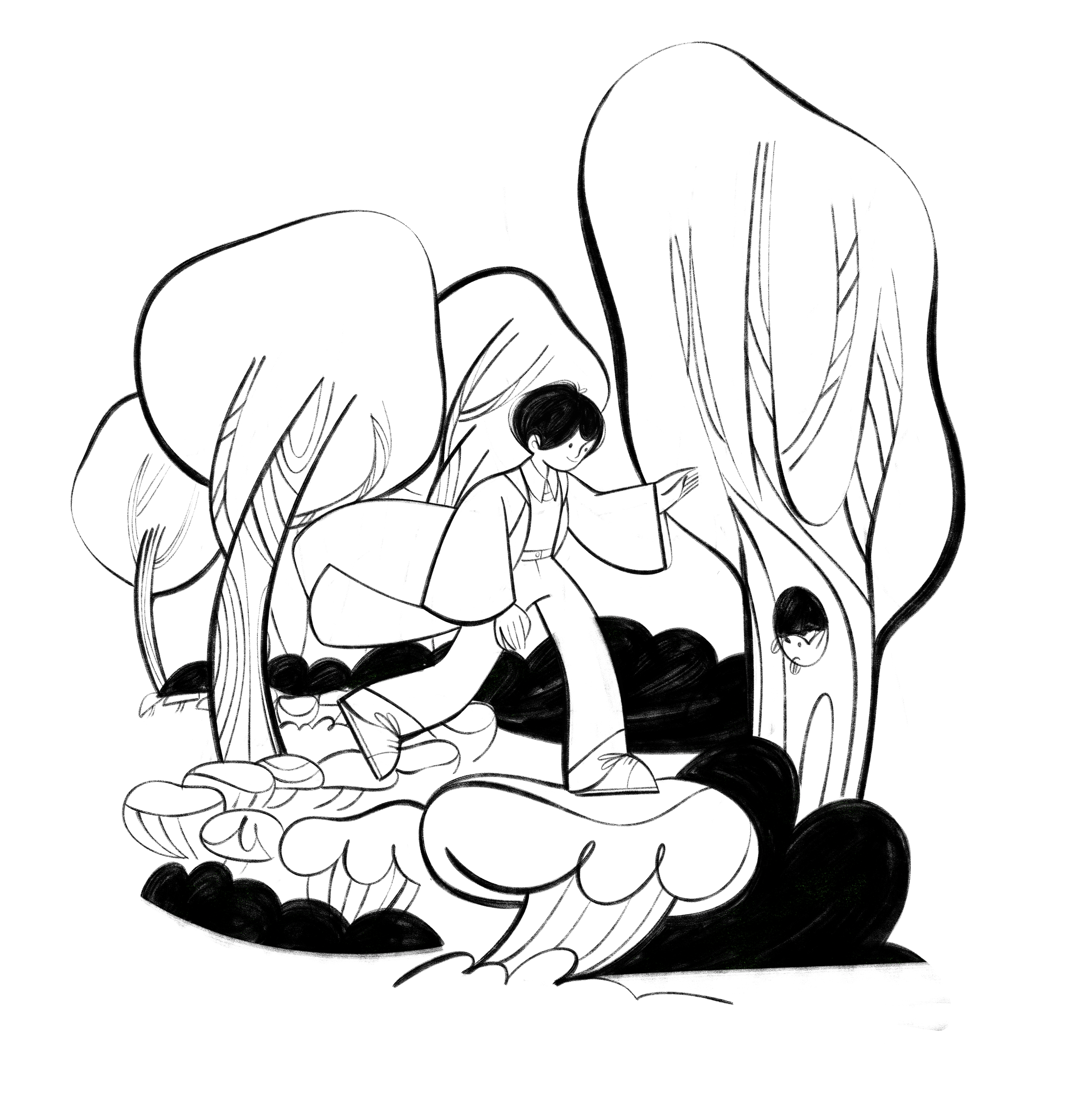
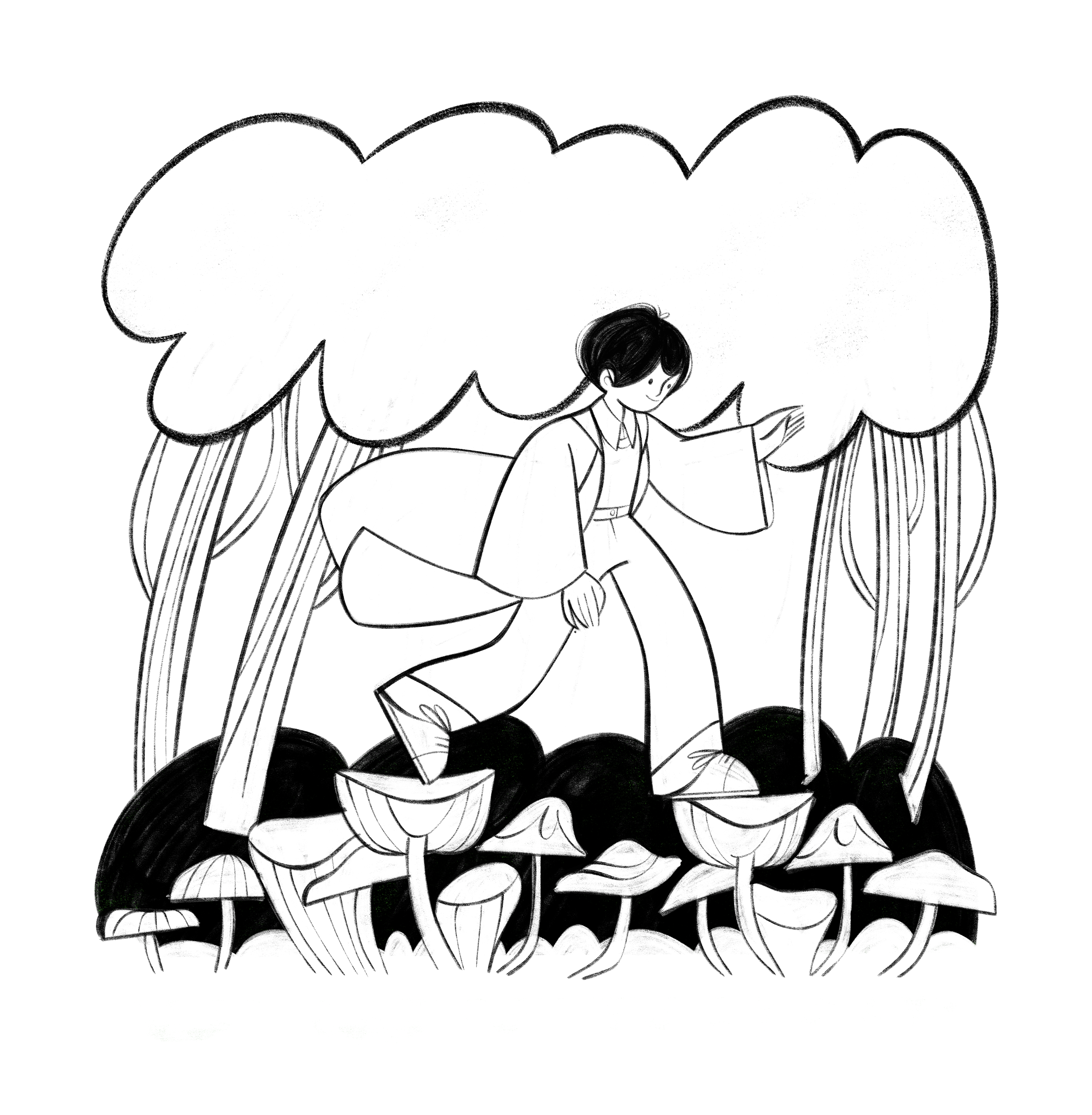
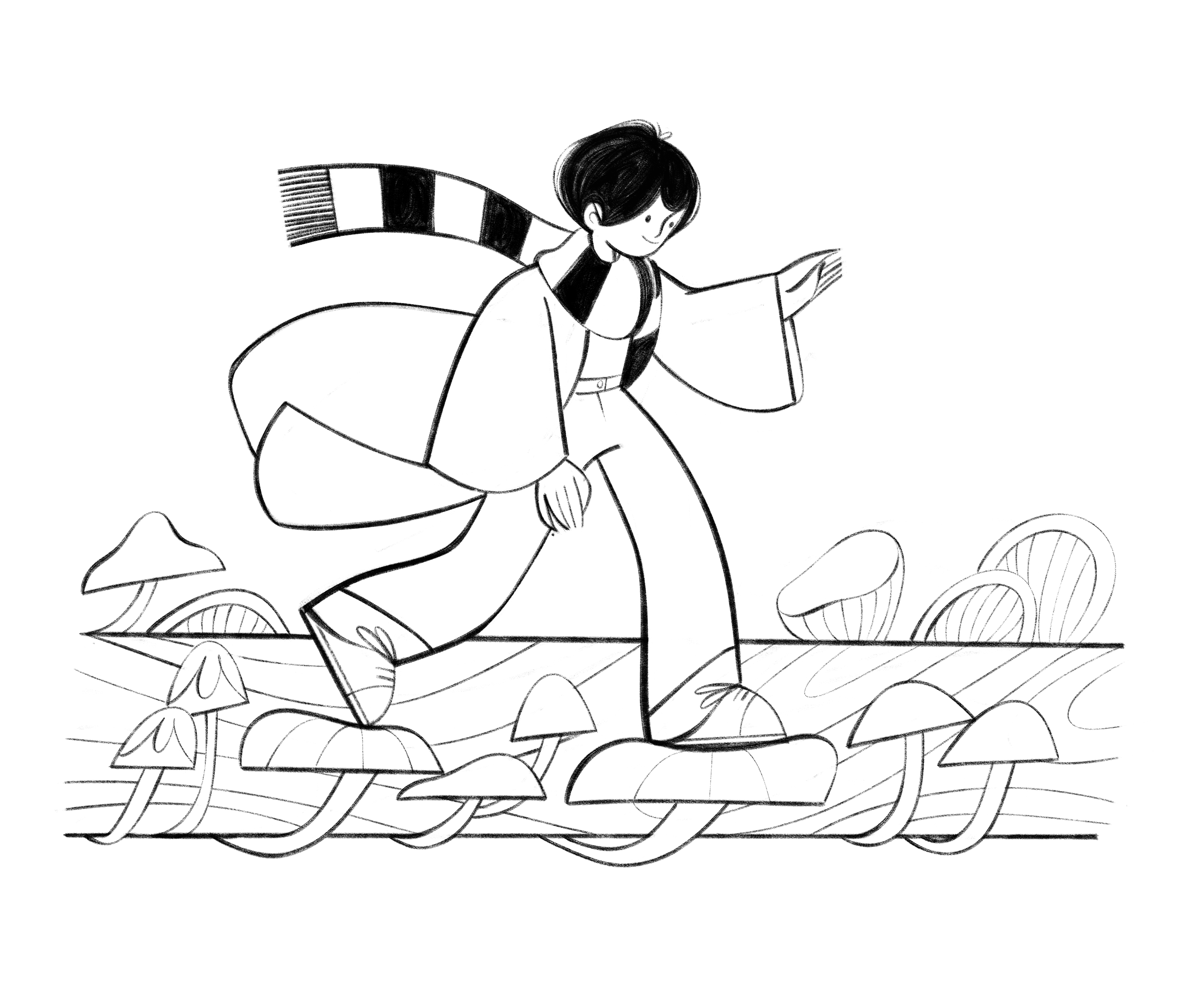
2nd key illustration - Growth
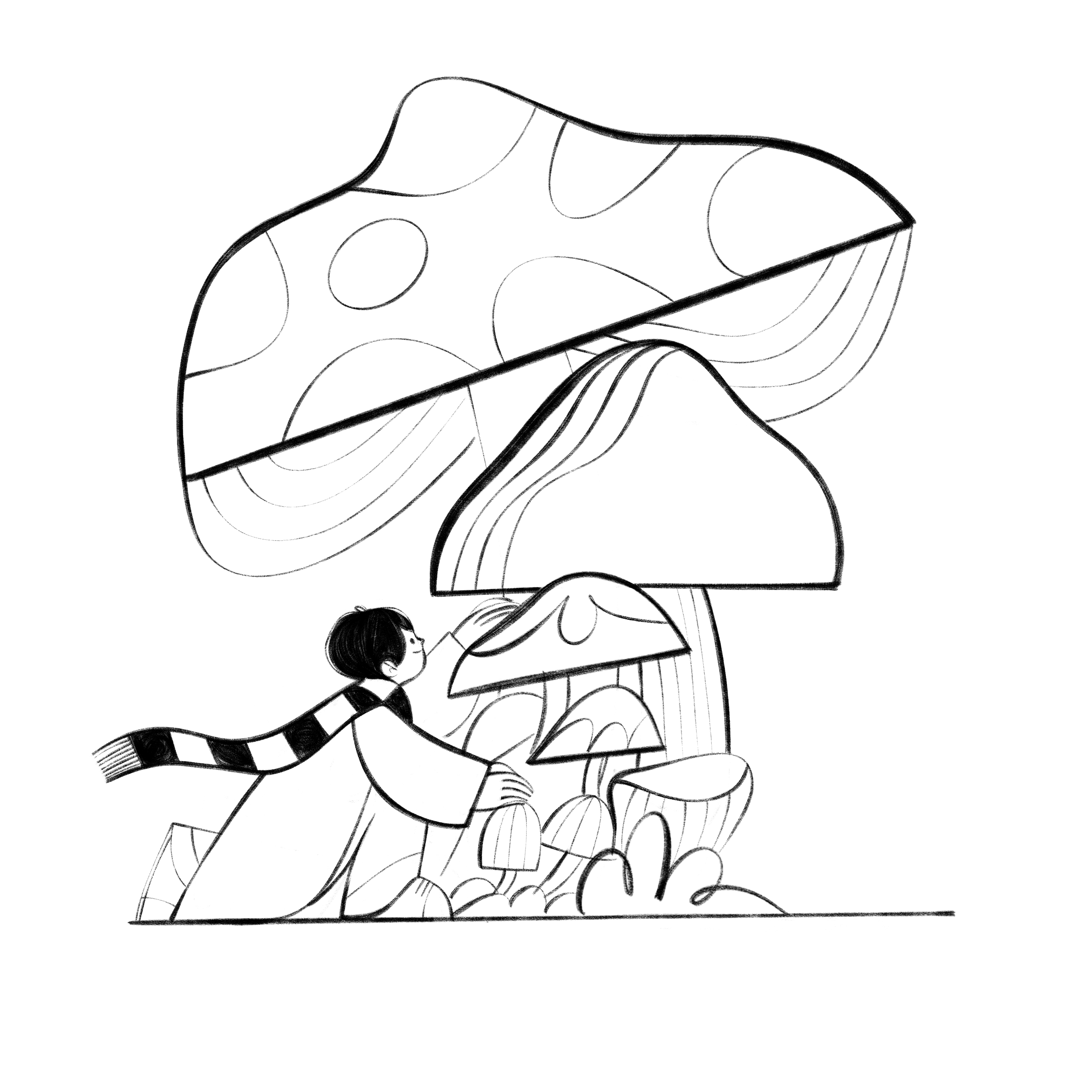
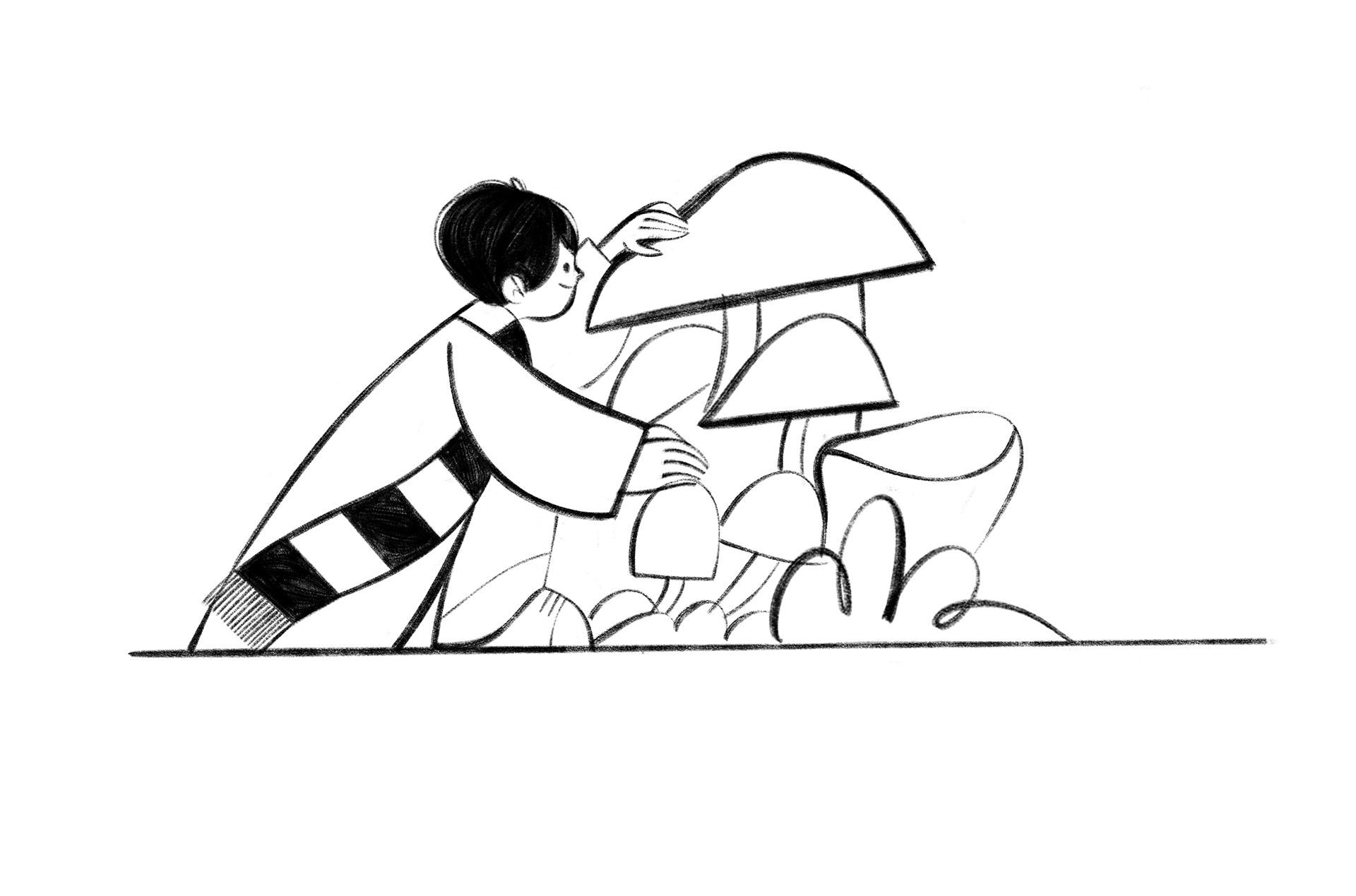
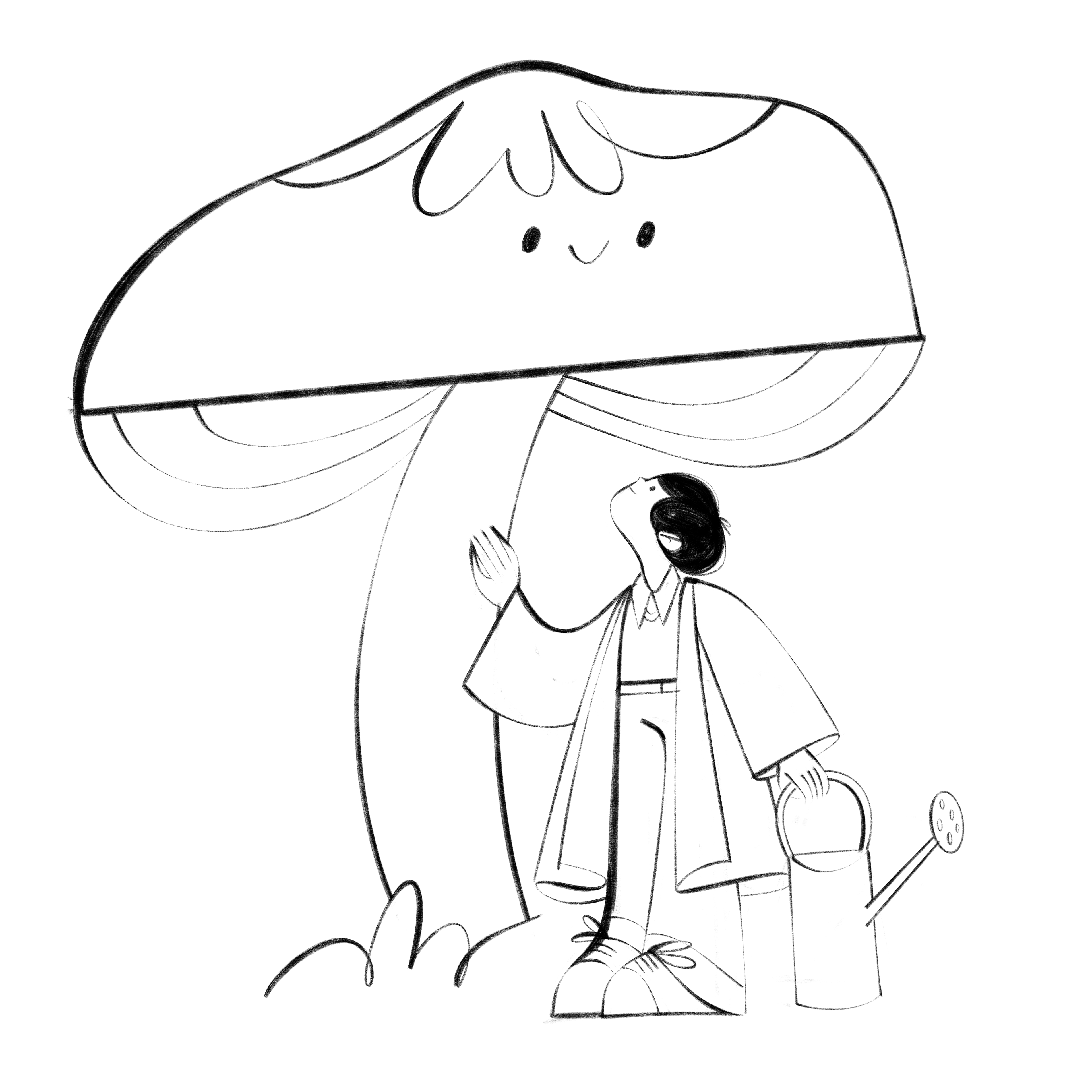
3rd key illustration - Ecosystem/Network
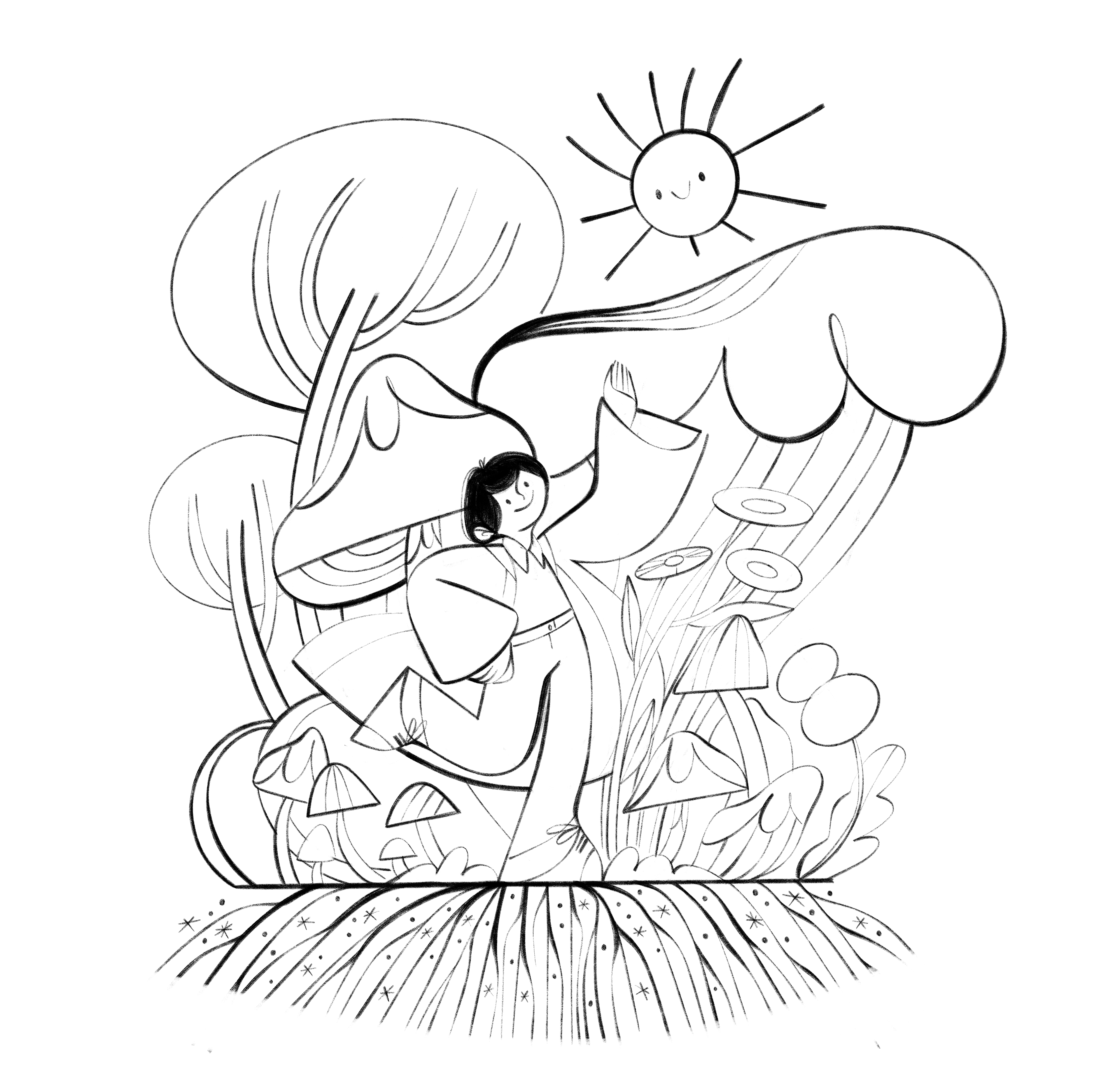
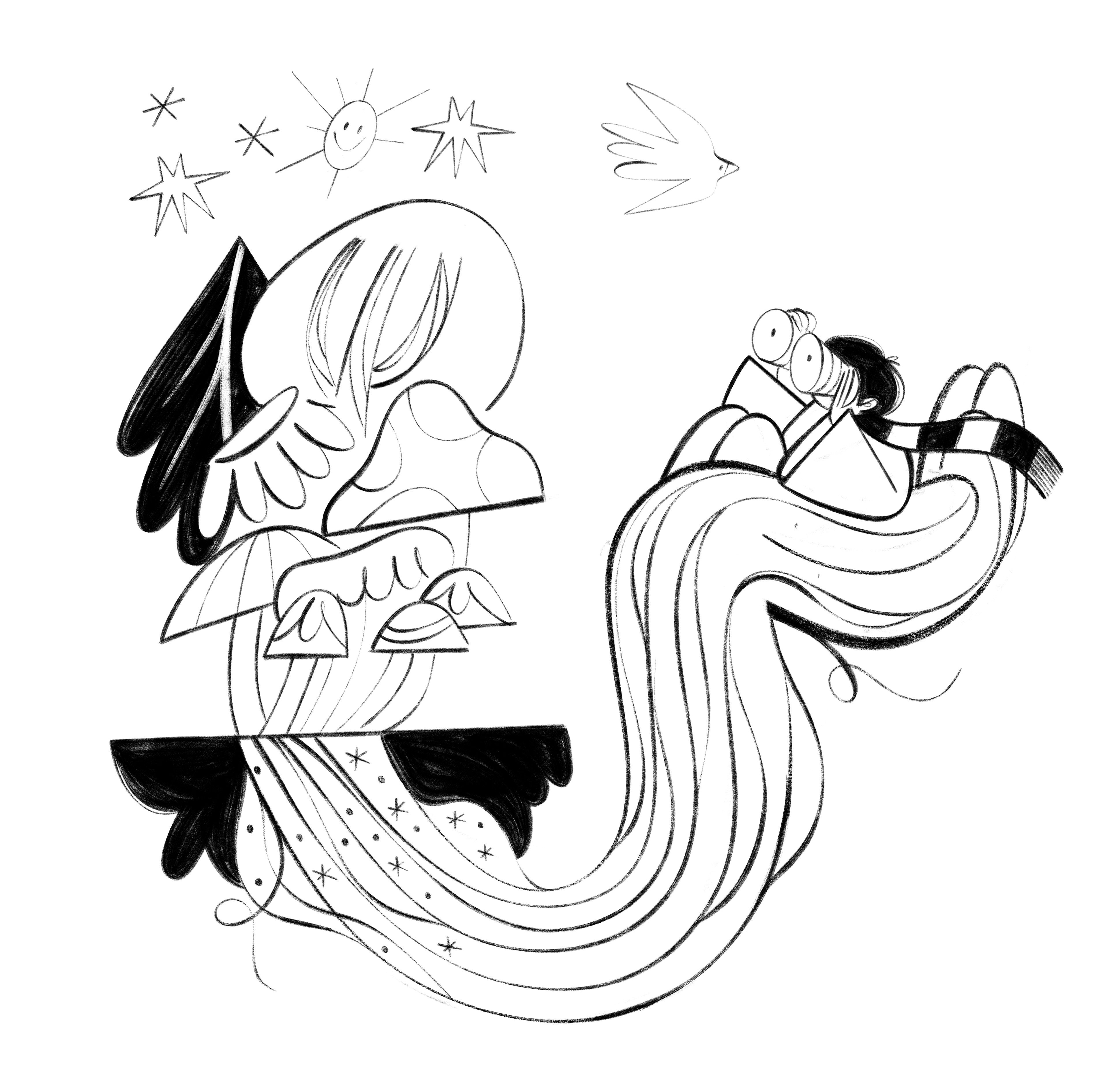
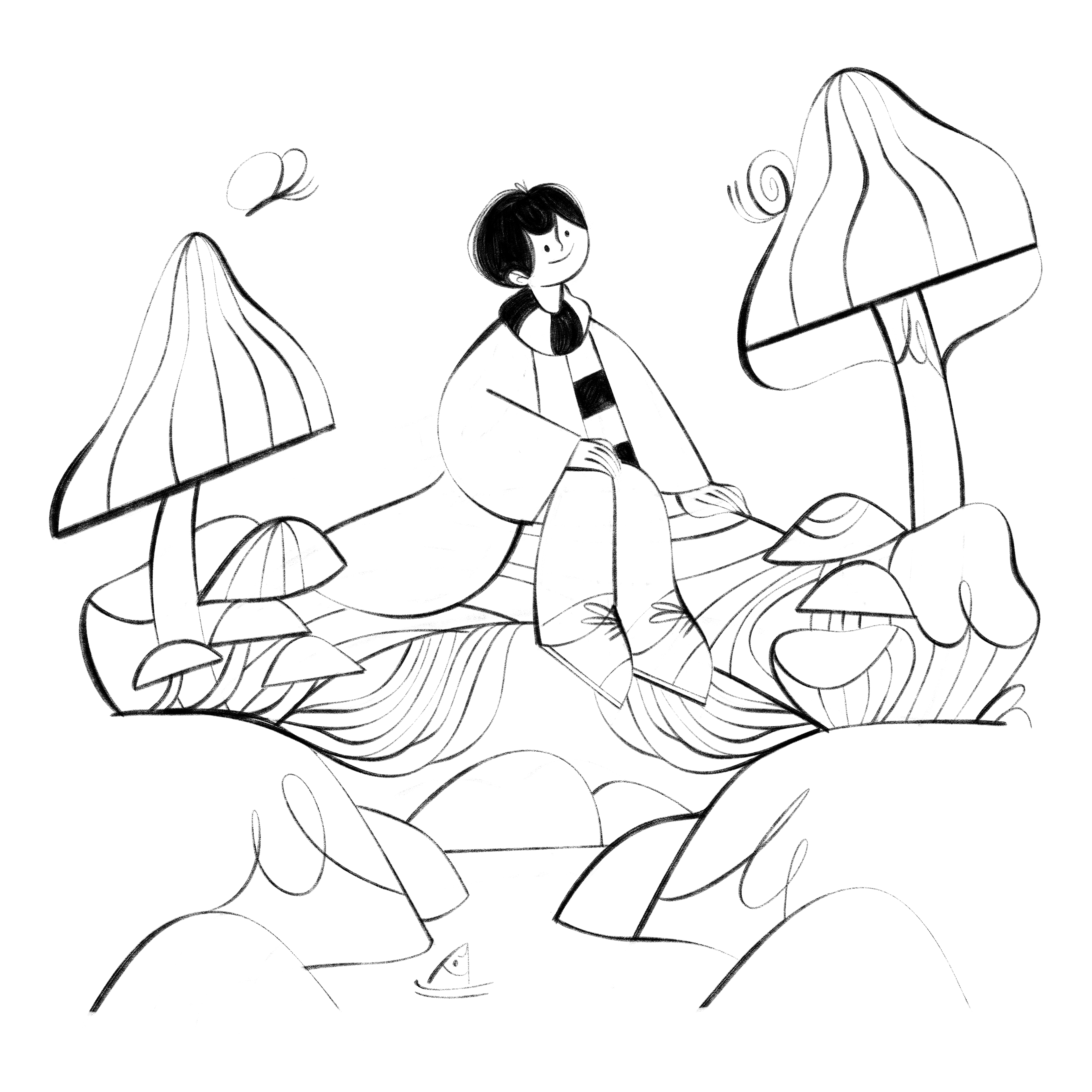
4th key illustration - Springboard into adulthood
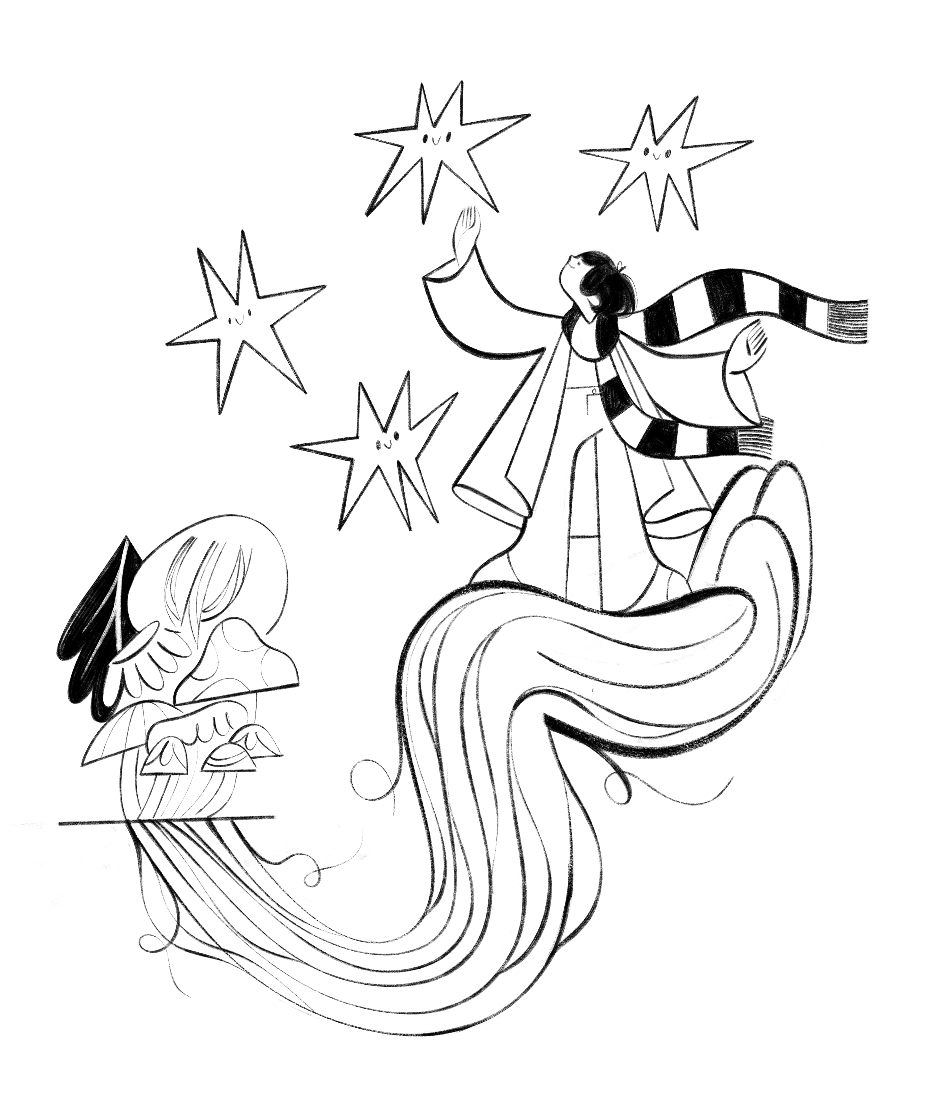
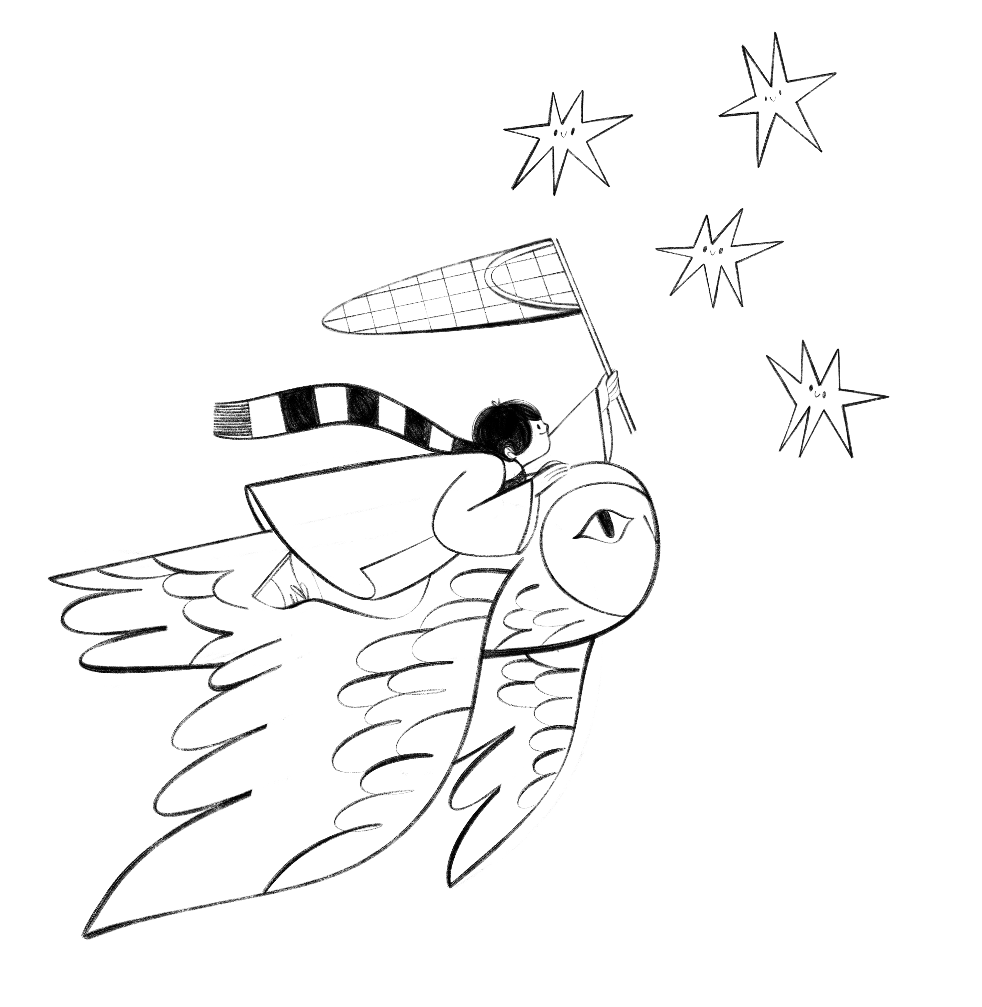
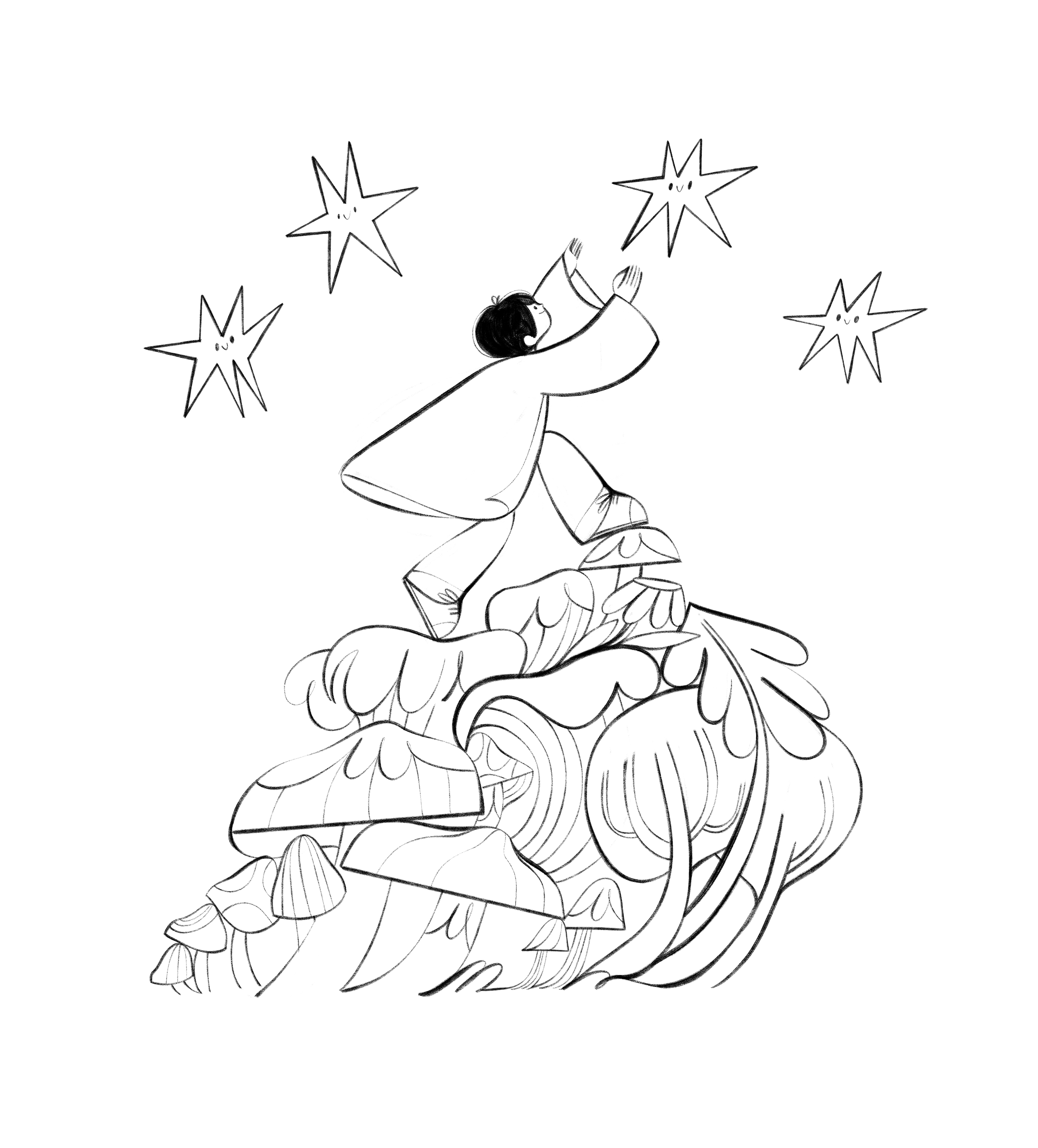
After a few rounds ( there were 3 rounds altogether) of back and forth,
the 4 chosen Key Illustrations were the following:
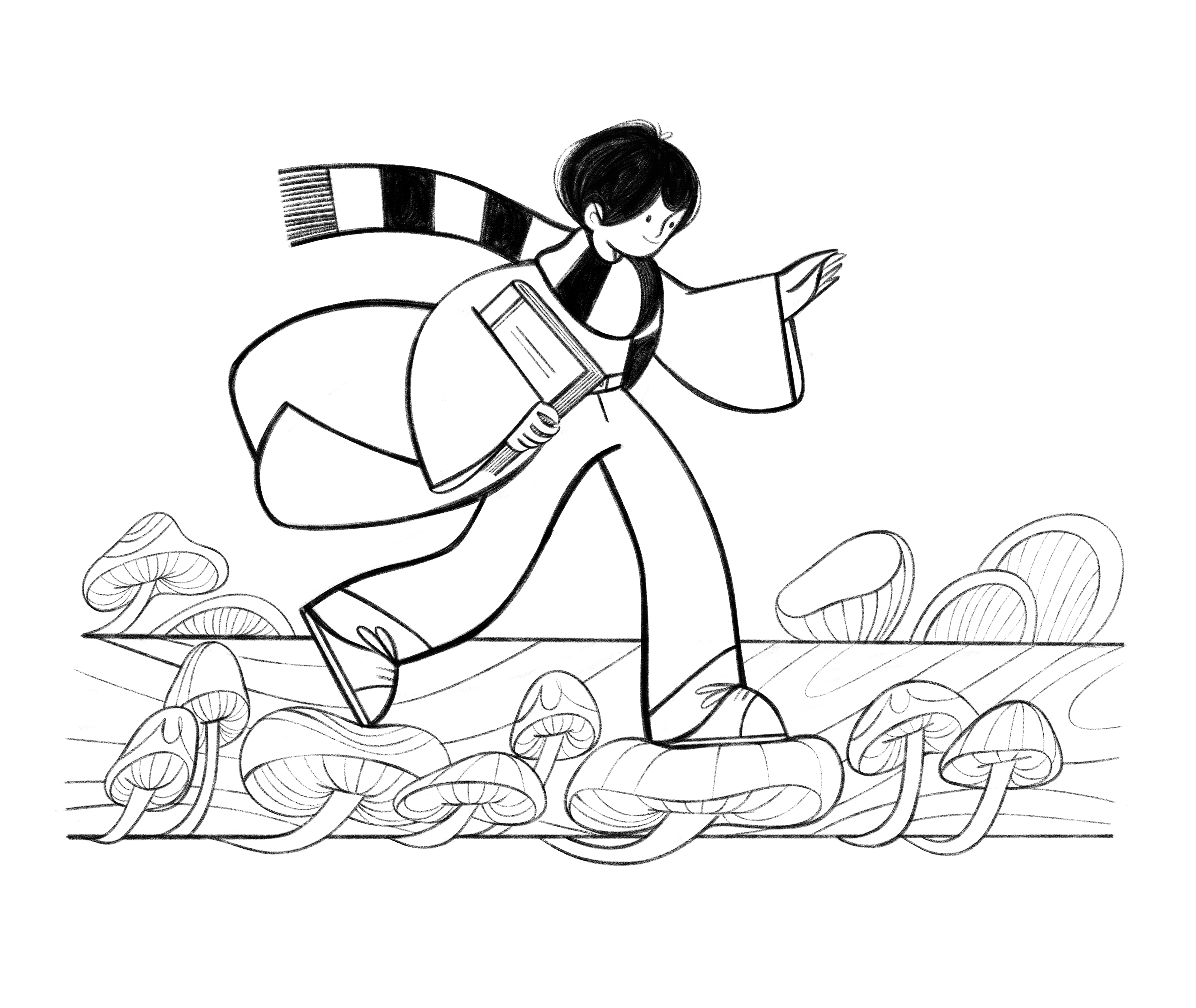
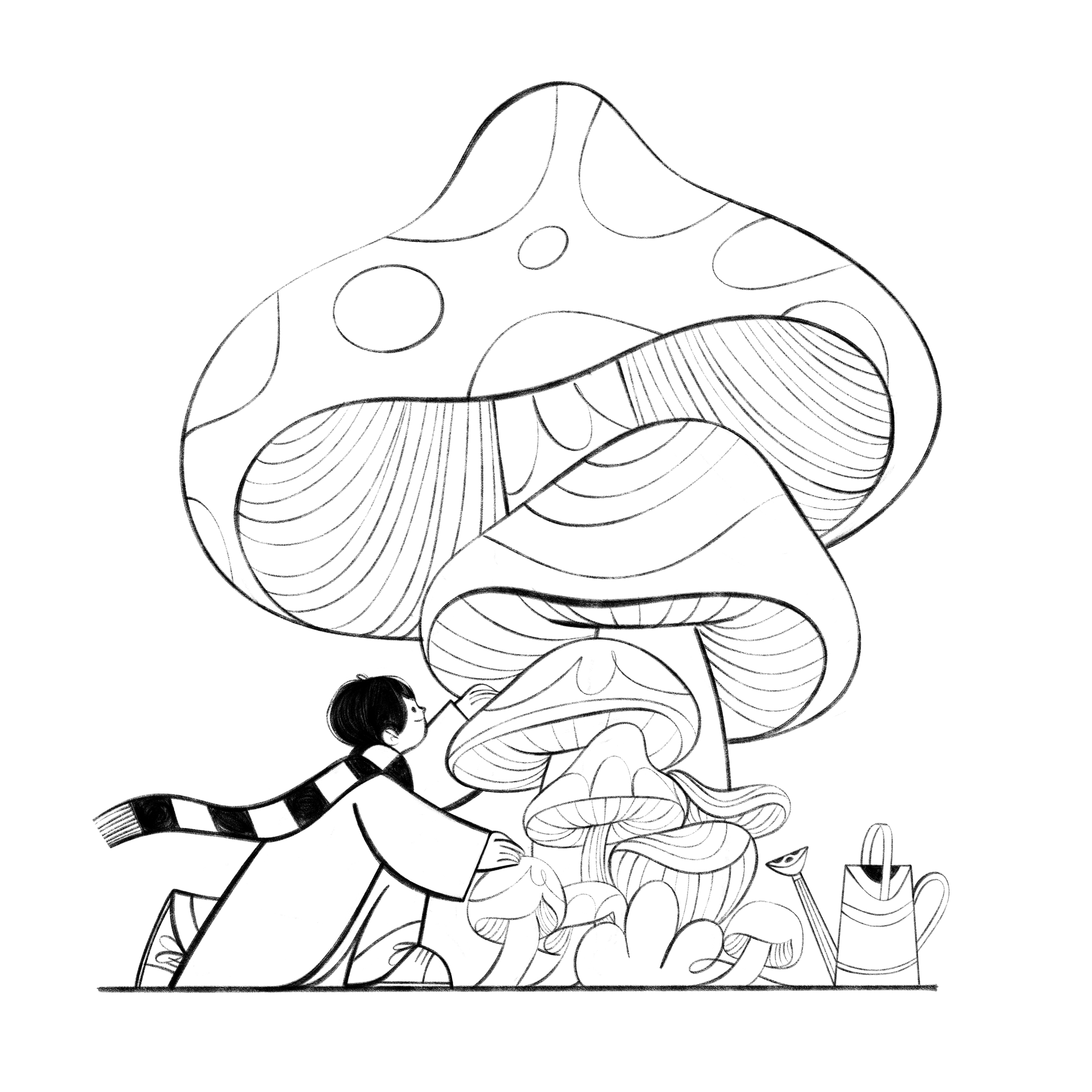
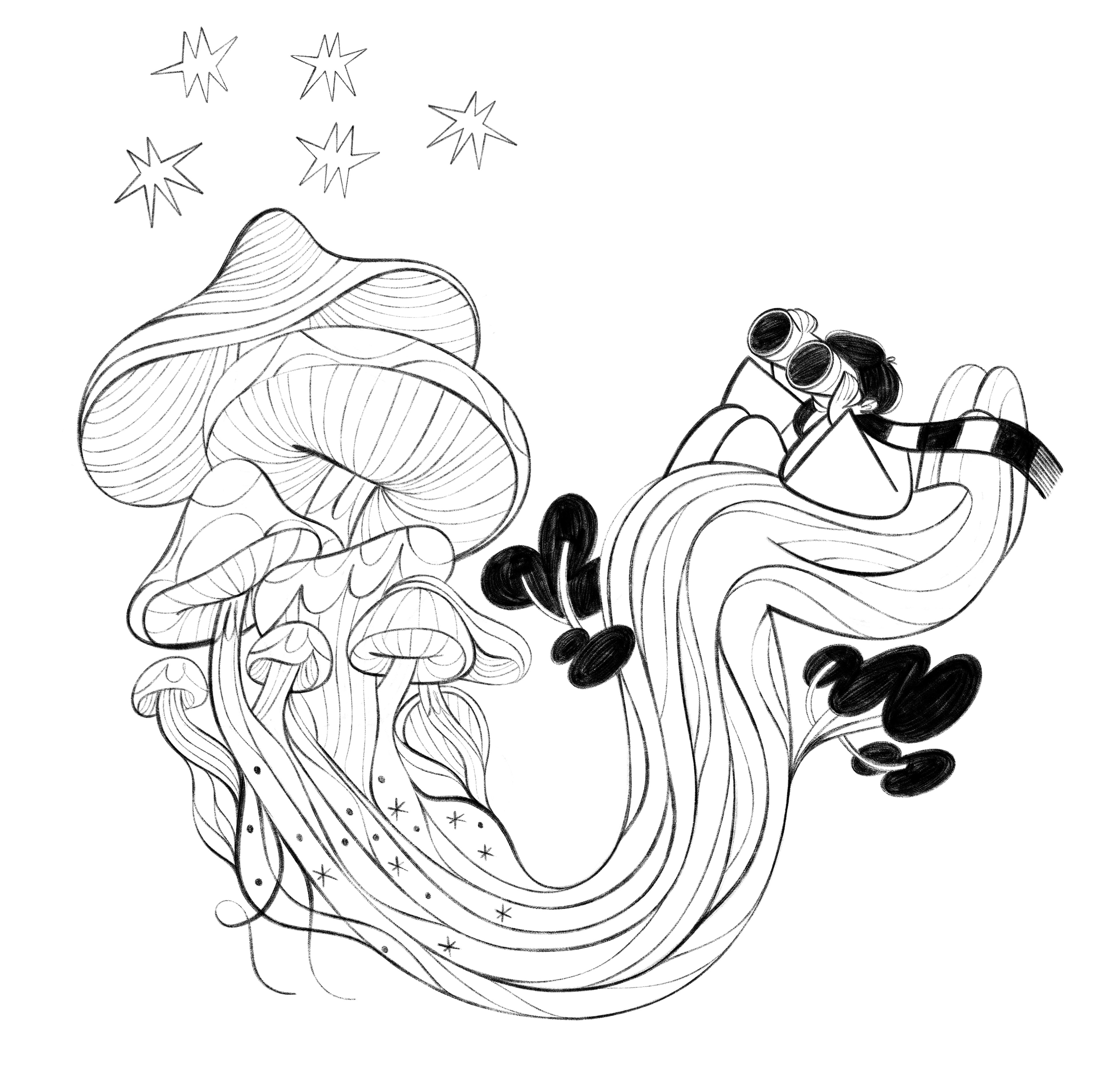
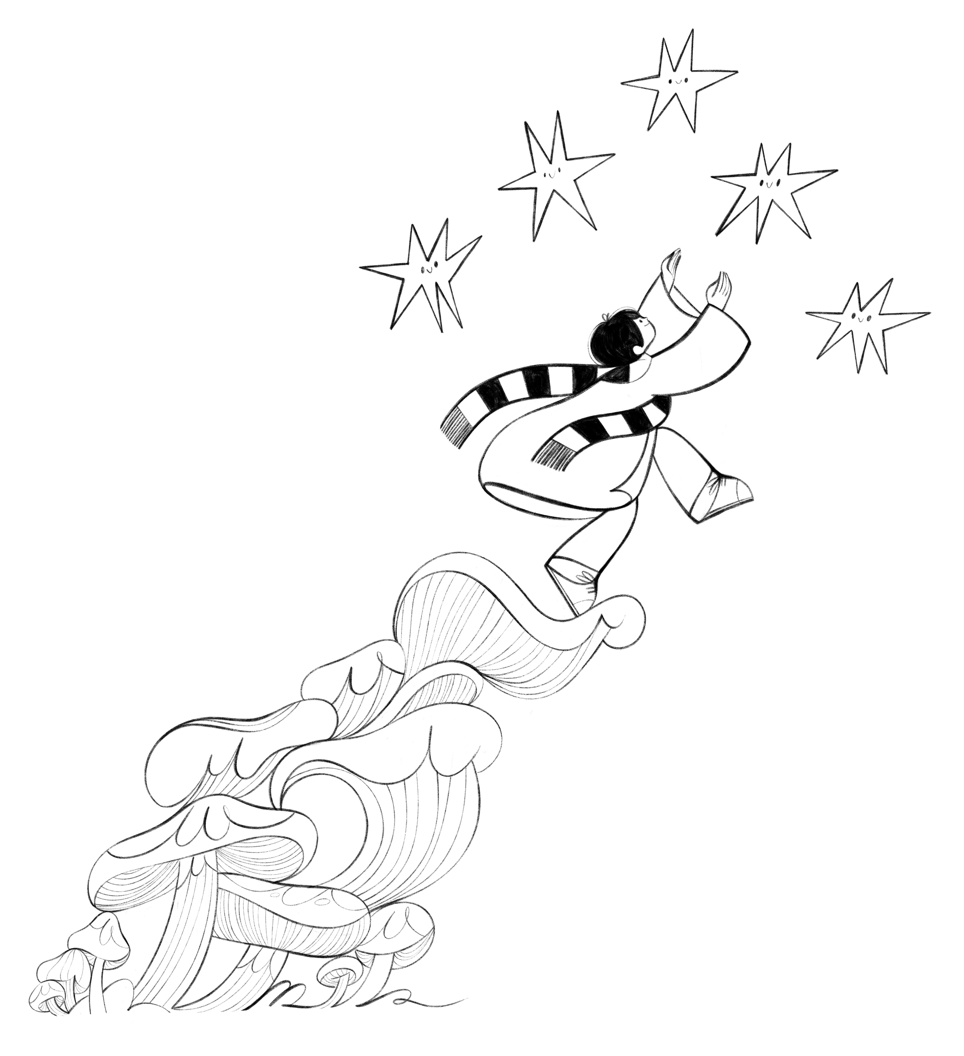
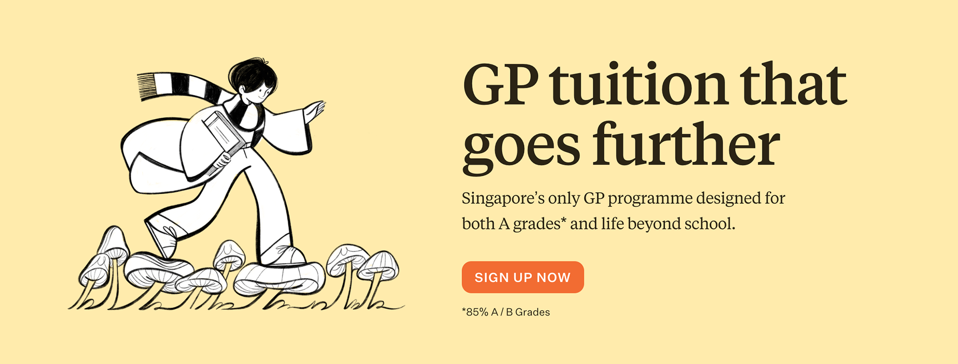
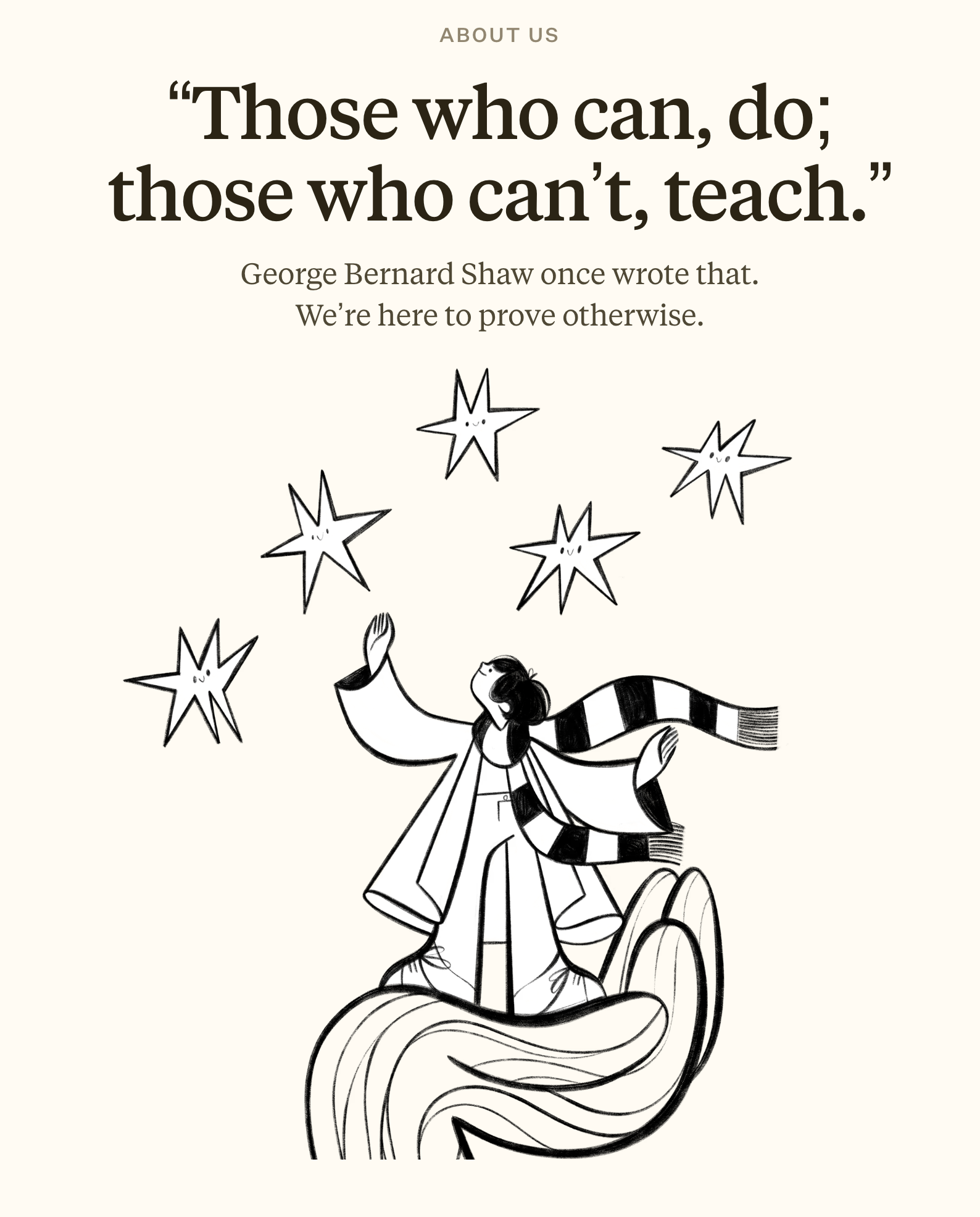
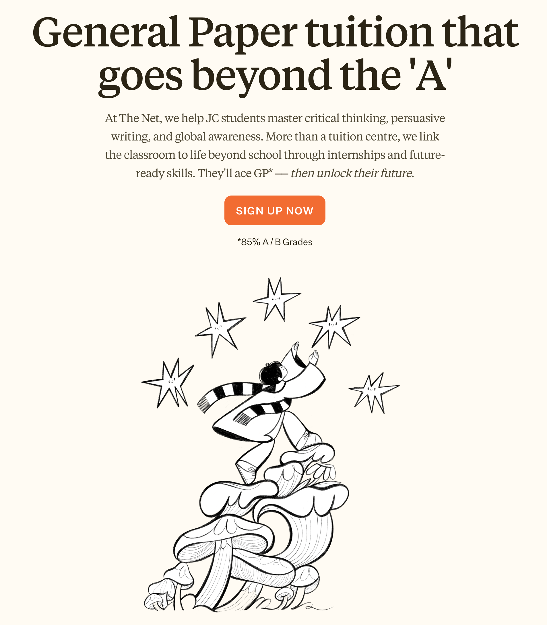
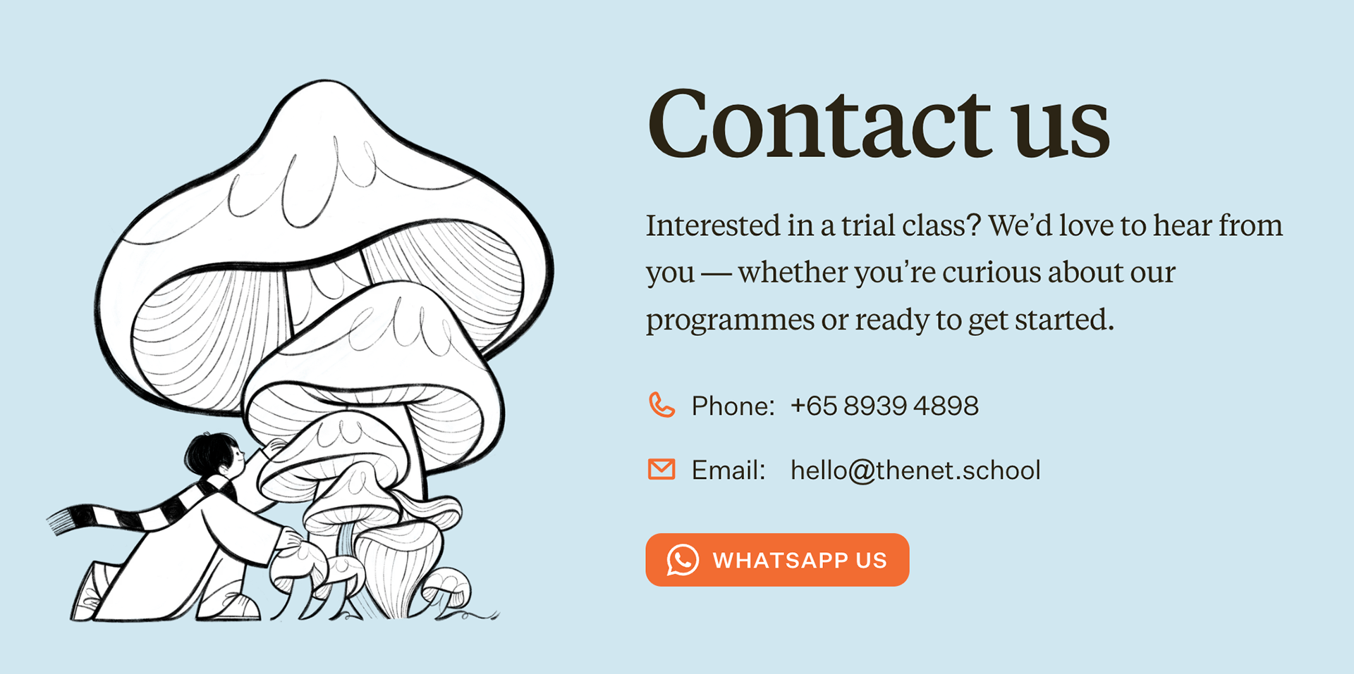
However after some testing, exploring and recalibrating on the client side, Lin and her wonderful team contacted me again, to revisit the concepts, and figure out a way to tweak them to make them pop on the new website. Some of the ideas were simplified, and I redrew all the illustrations using a stronger linework, plus a 5th key illustration joined the party, so the final line up turned out as follows:
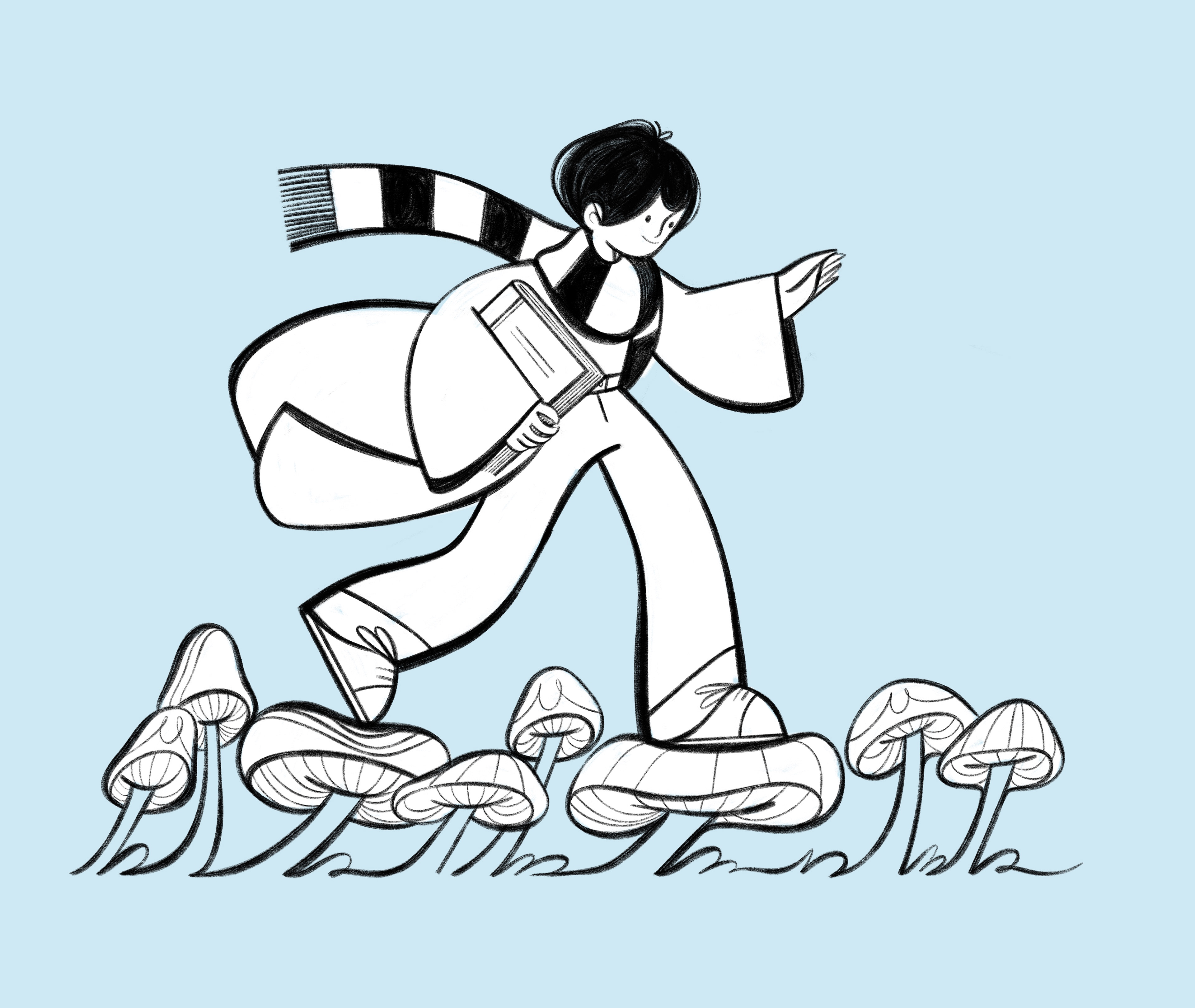
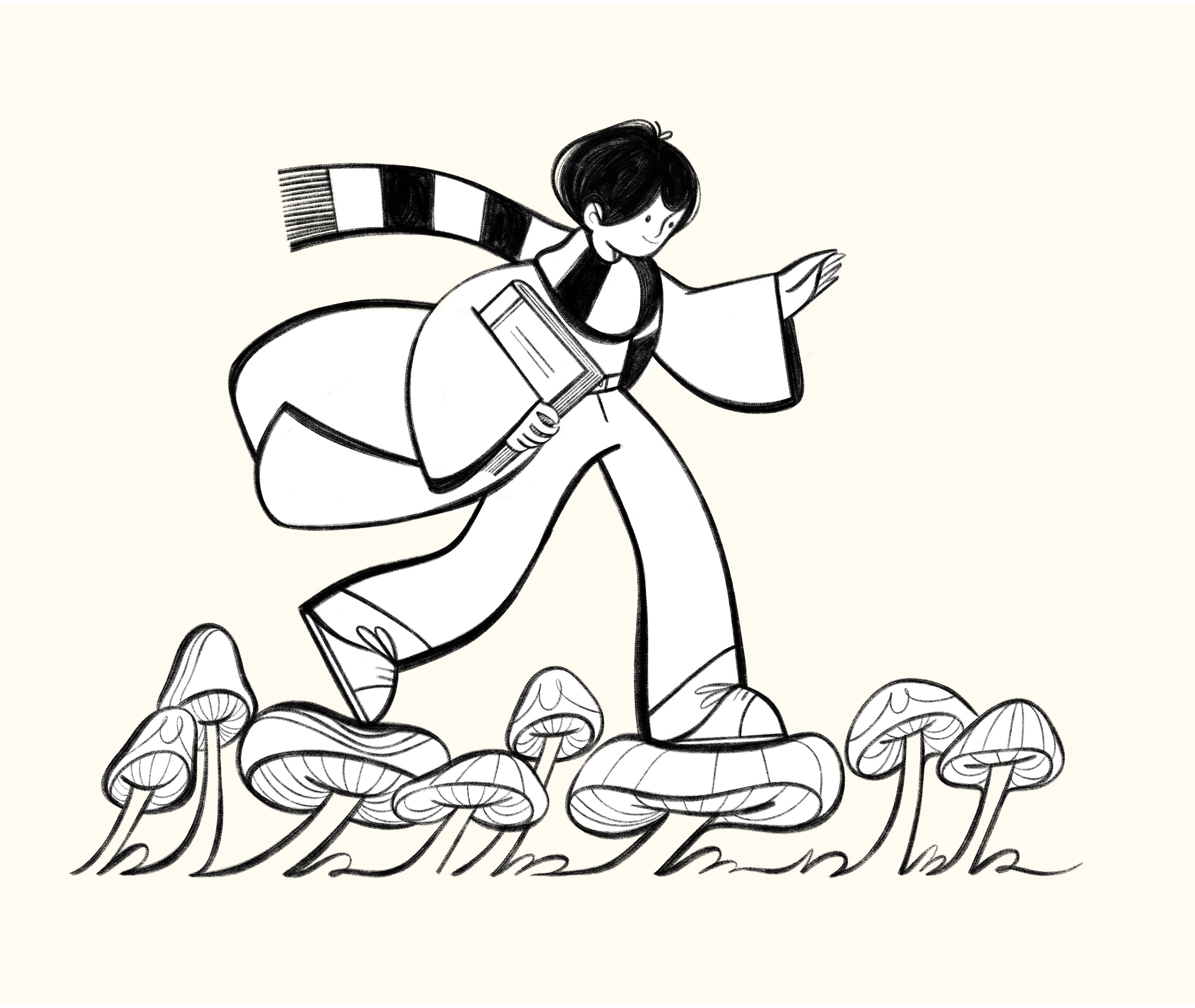
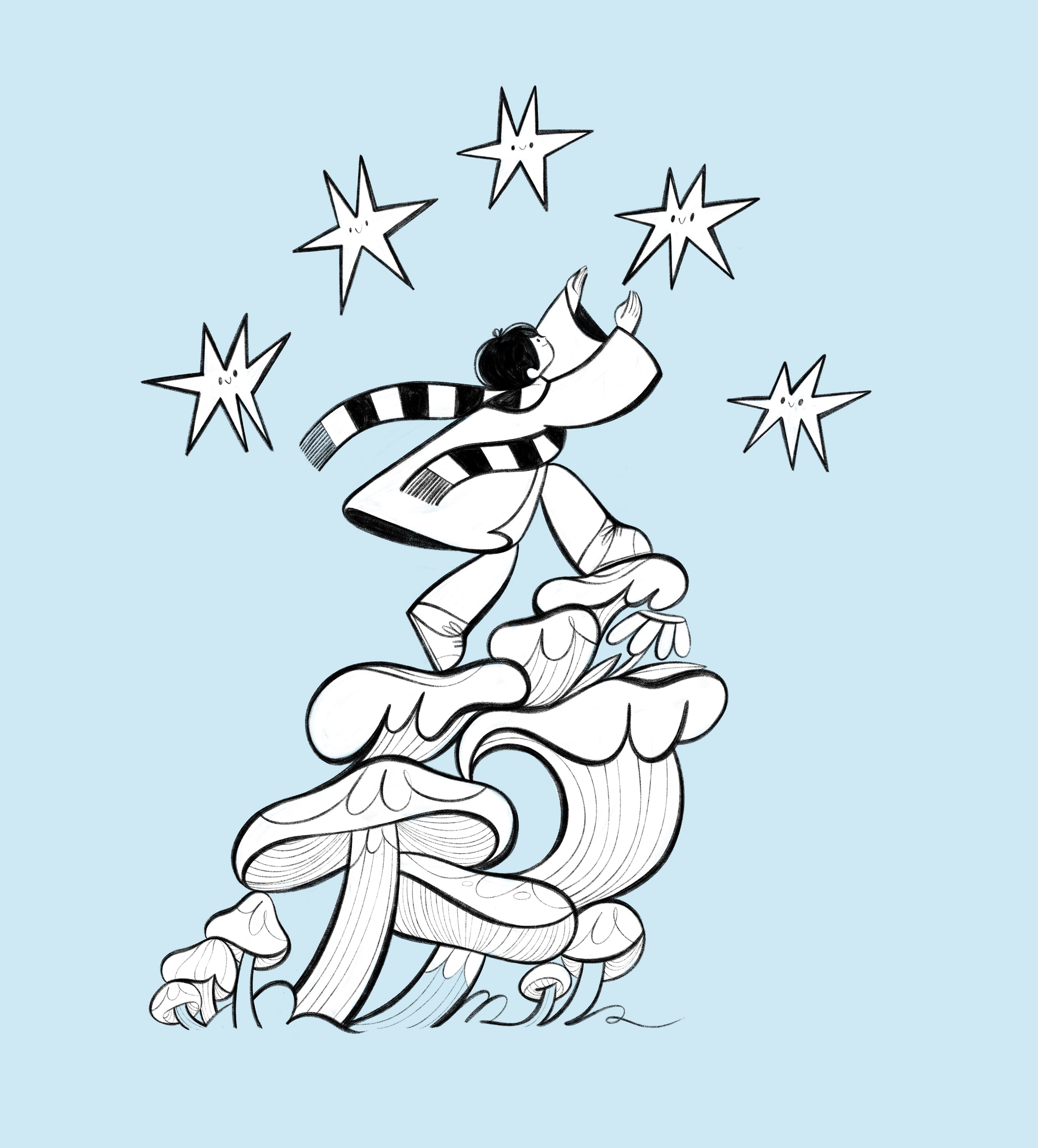
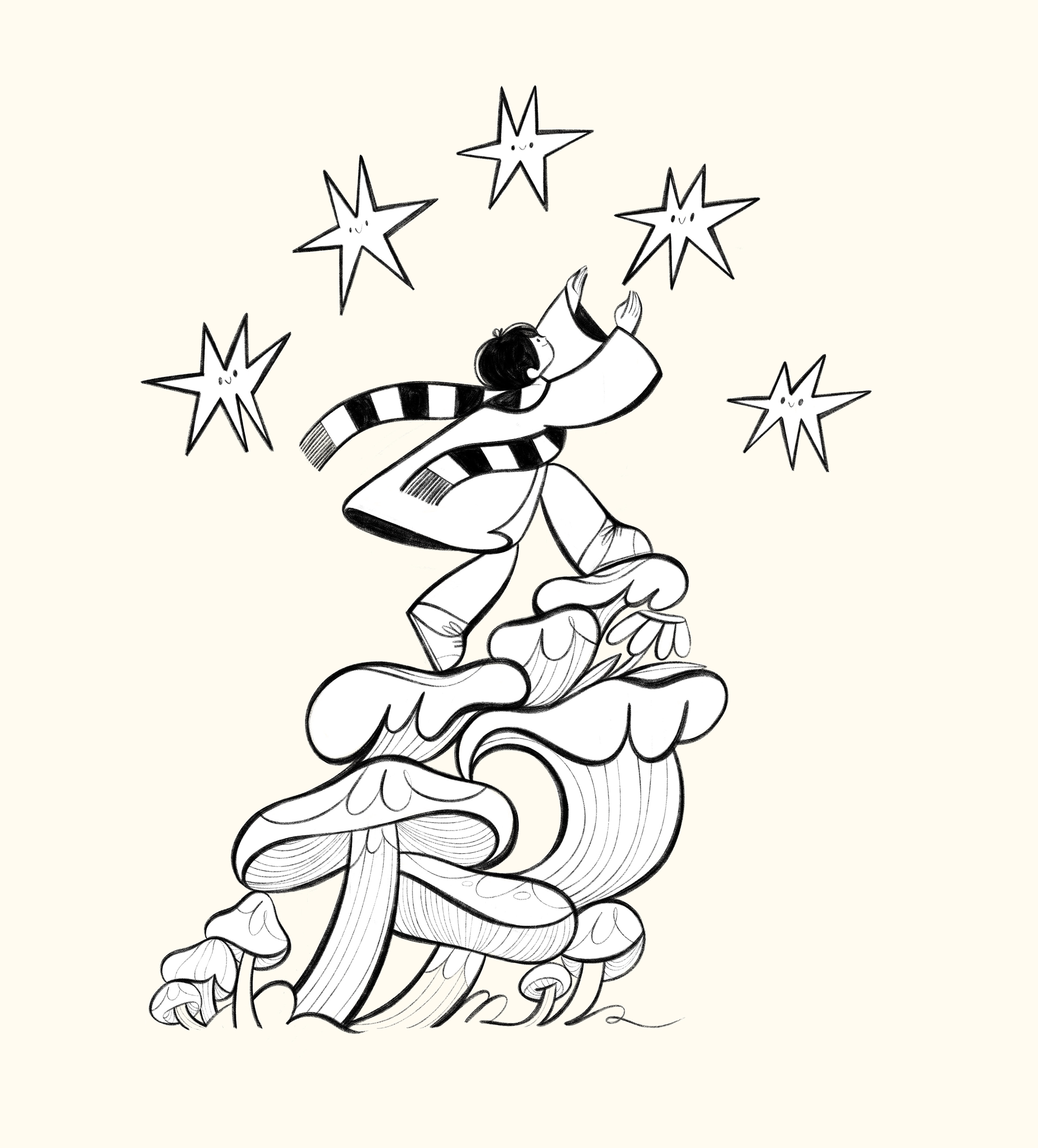
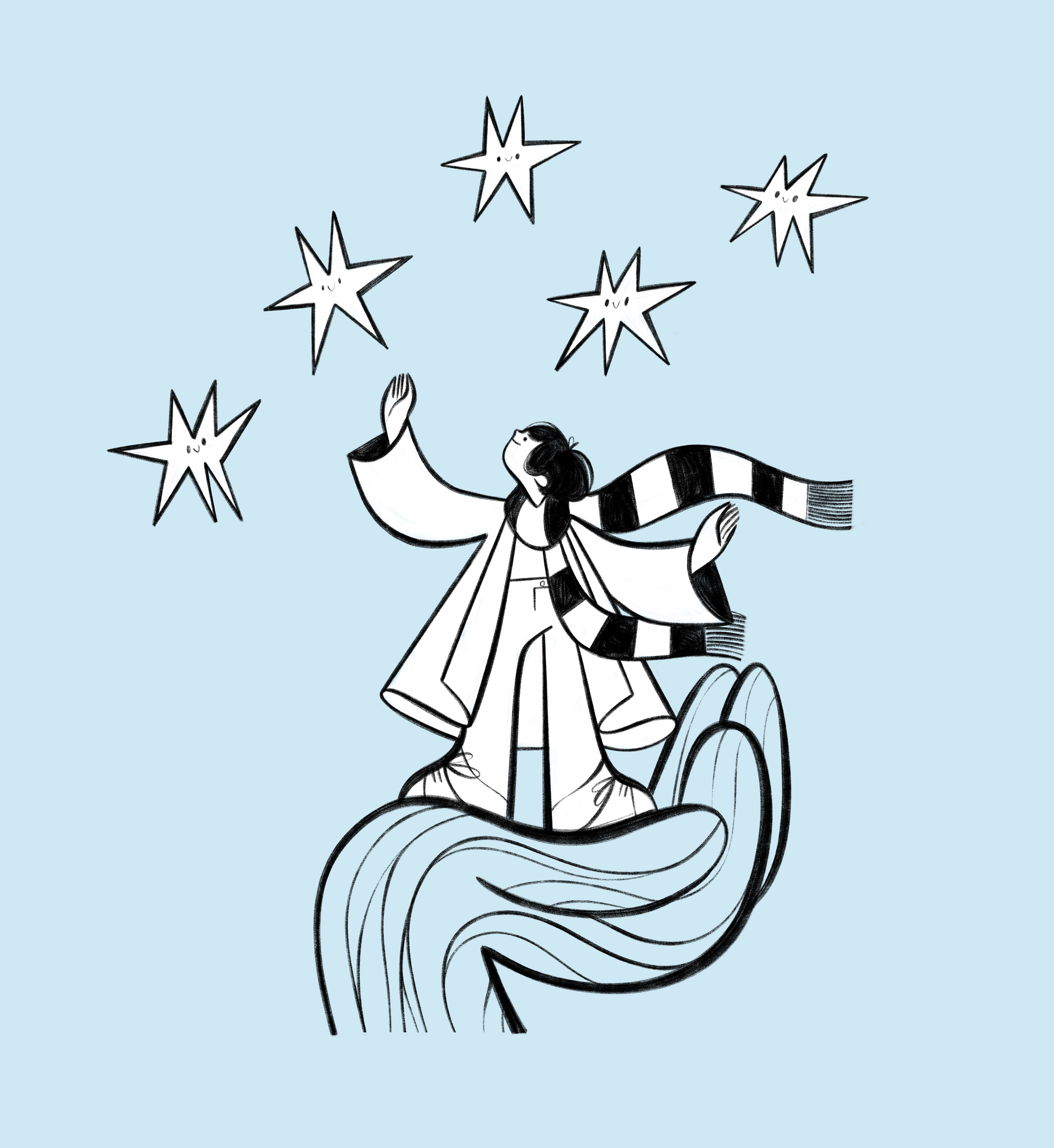
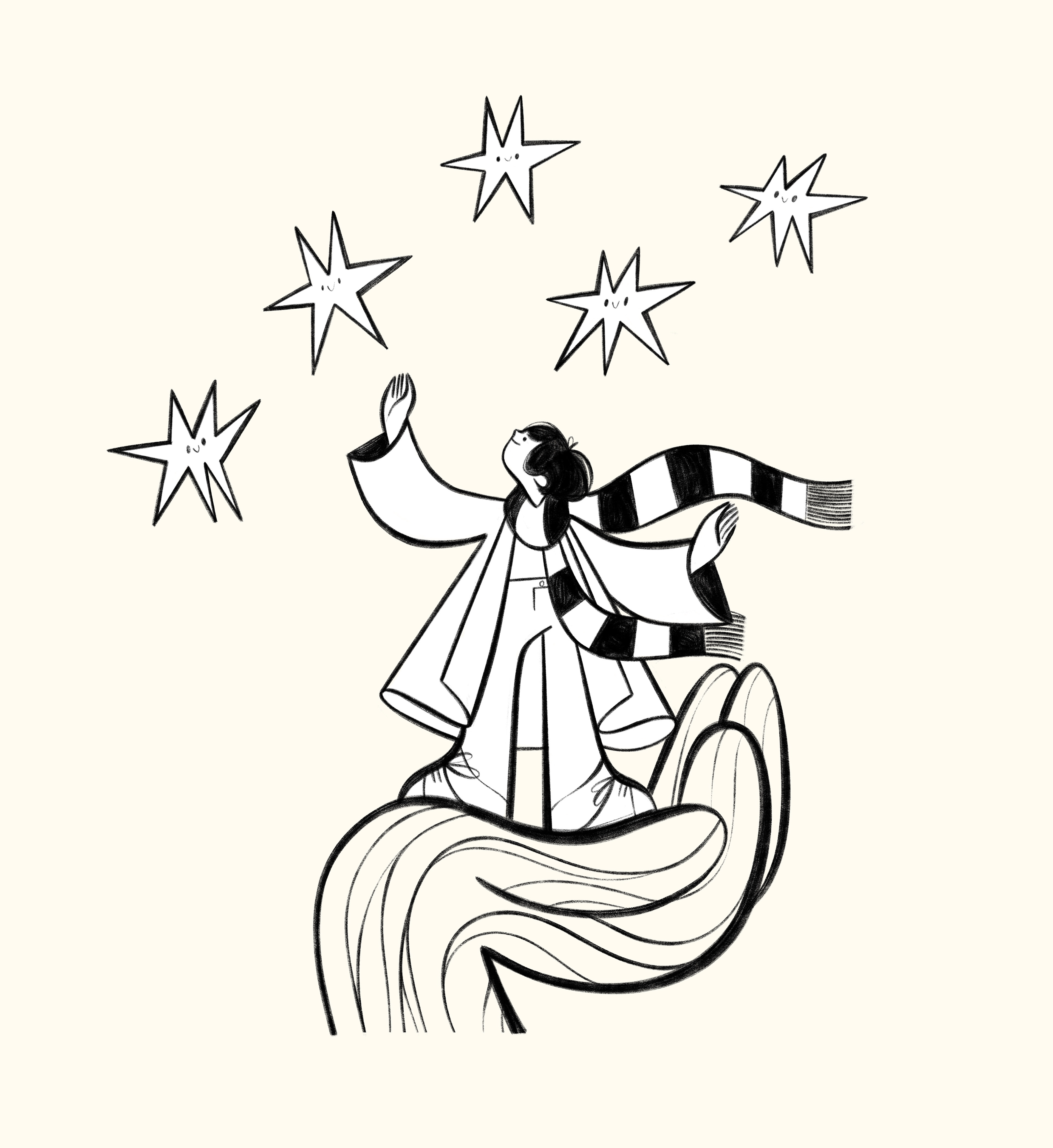
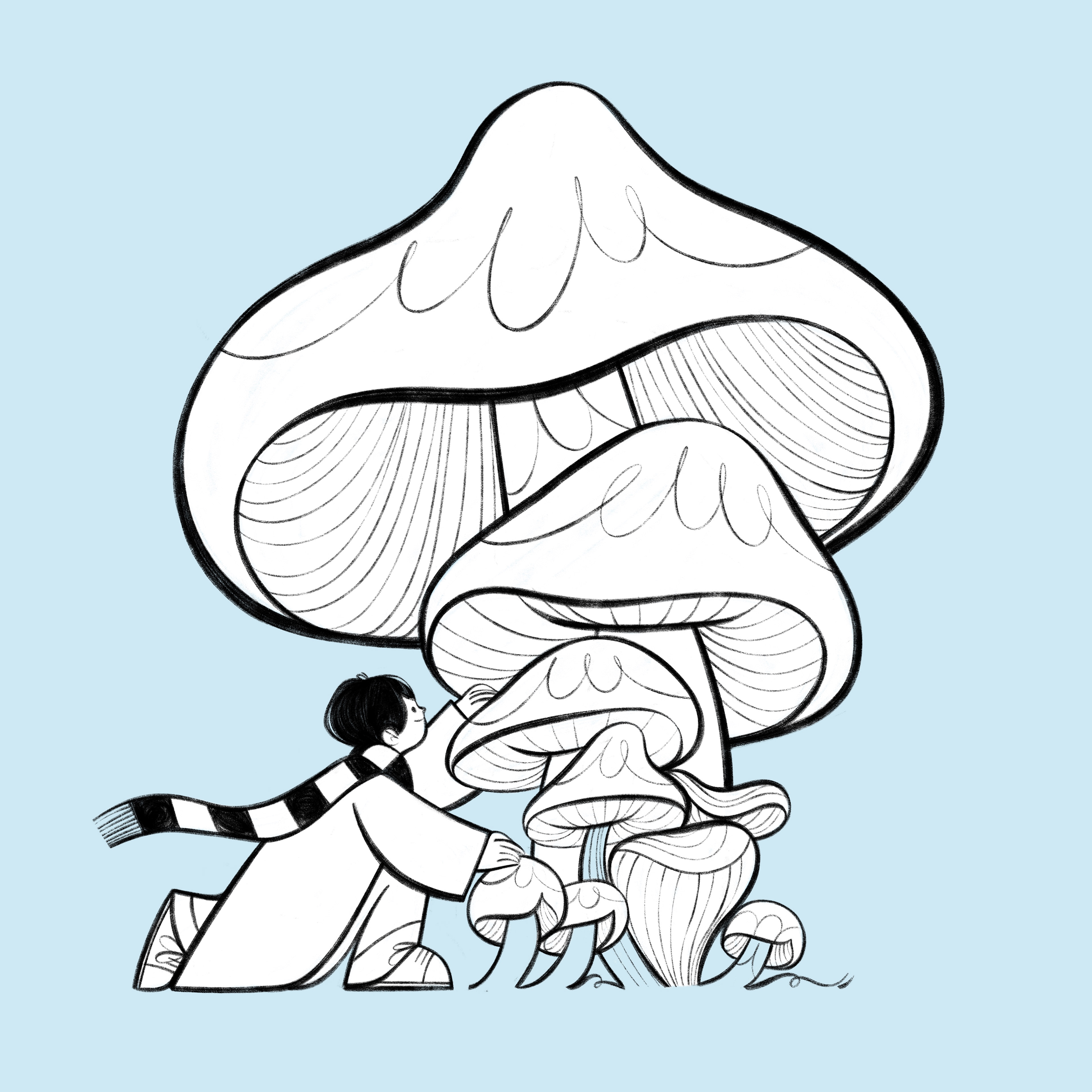
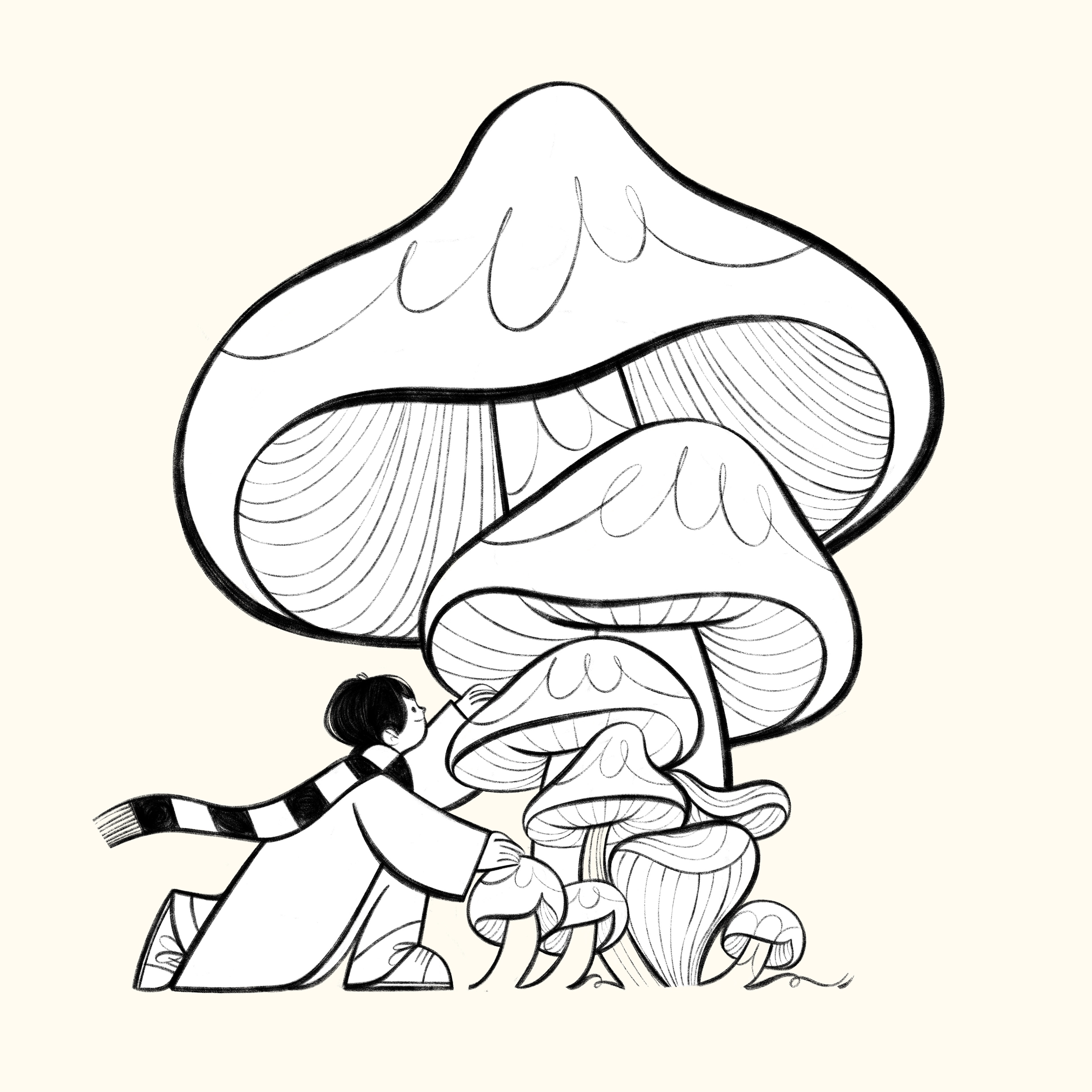
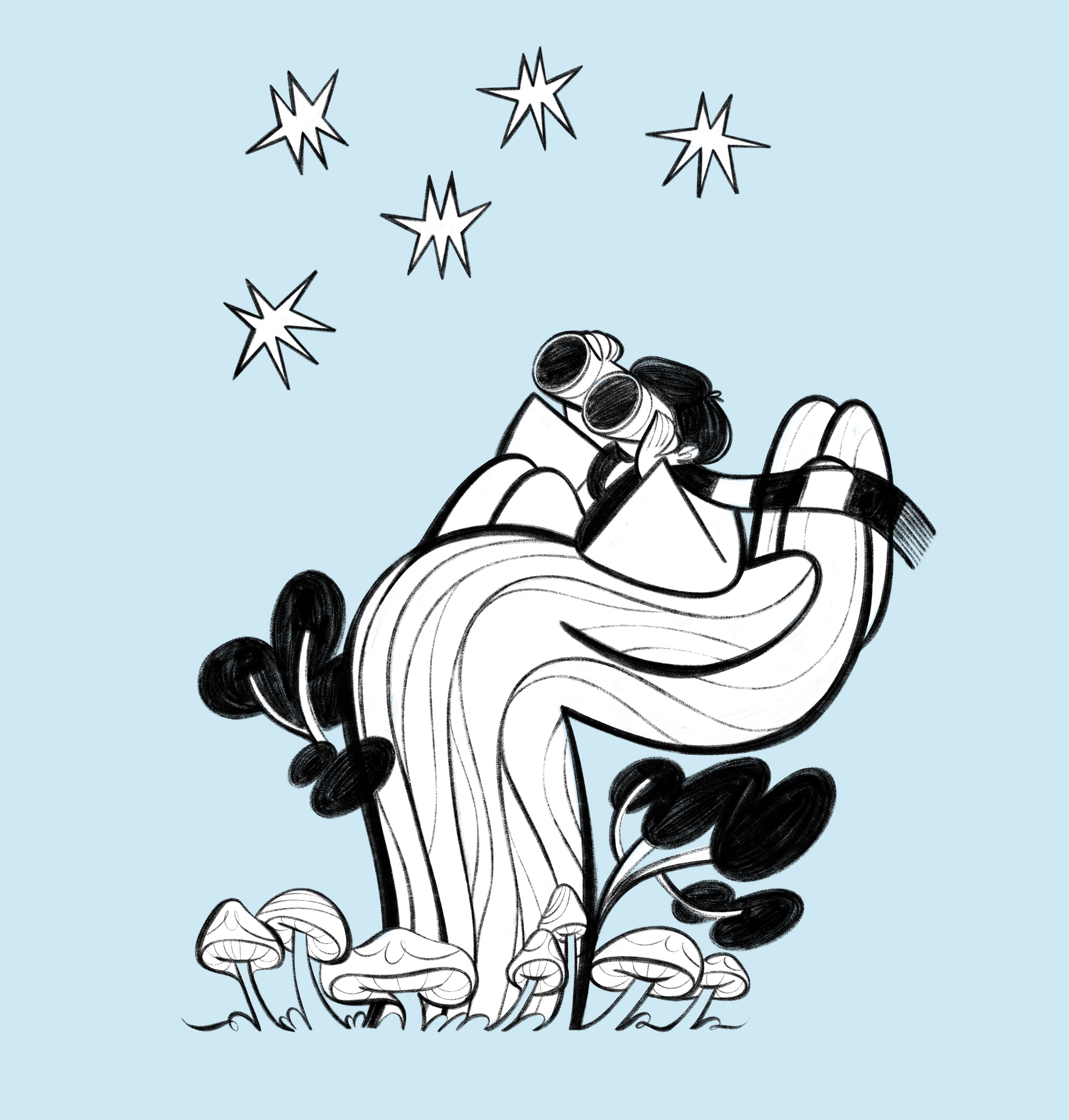
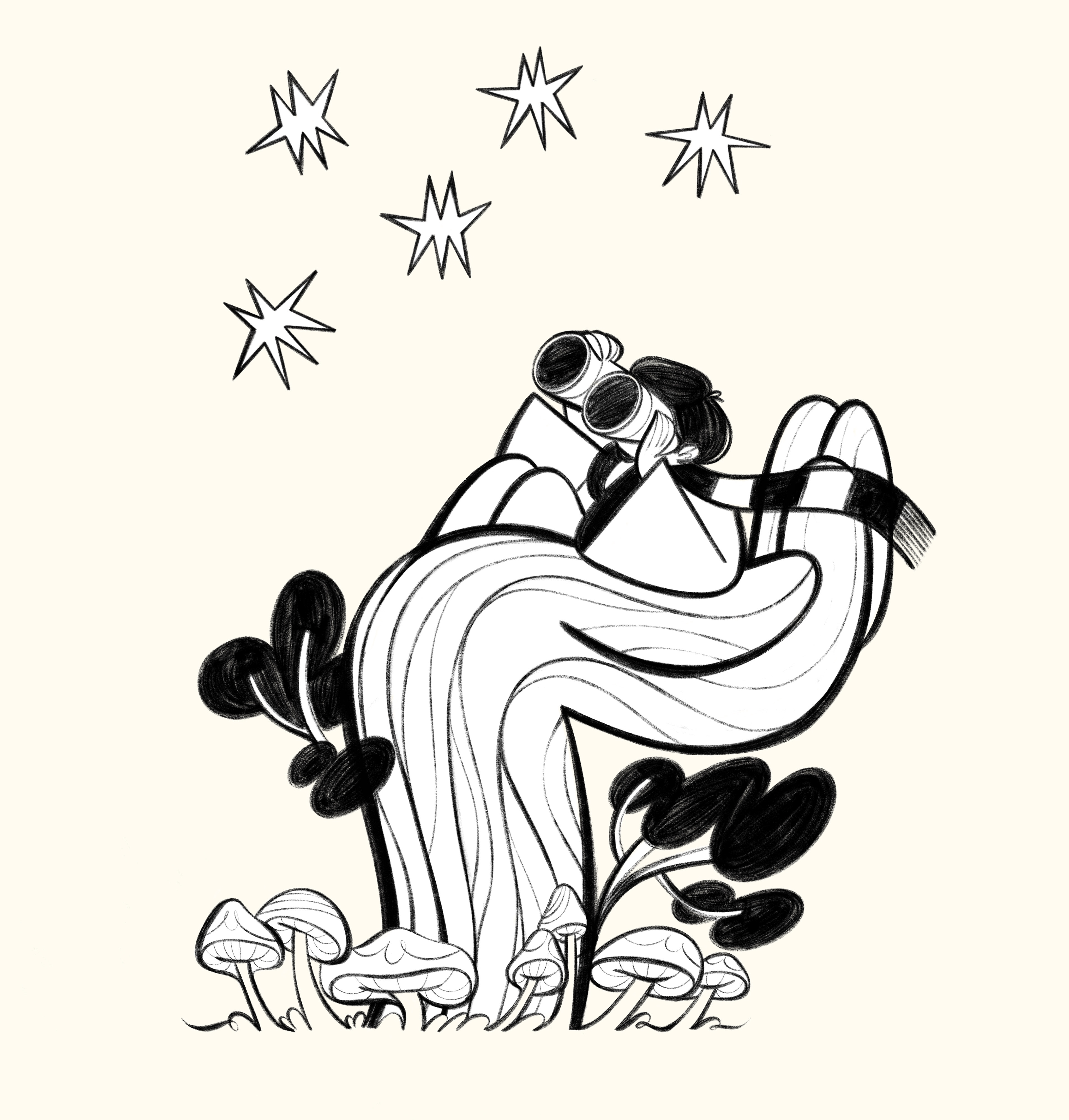
Aaand action: https://thenet.school/
Honorary mention to Jian Hong, the awesome designer behind the website,
and creator of the gorgeous brand identity work.
